01 Industry Observation
Life sciences presentations are among the most demanding communication formats in any industry.
A single oncology deck must simultaneously serve a scientific audience, an executive leadership team, and often a global regulatory context - each with different needs, different tolerances for density, and different definitions of clarity. The same pressure shows up in pharmaceutical marketing presentations, where HCP, patient, and payer materials all need different evidence structures.
After processing over 10,000 slides across pharma, biotech, and life sciences consulting firms across industries, A1 Slides identified a consistent pattern: the gap between what generic design tools offer and what life sciences communicators actually need is wide, and it is growing.
TL;DR
- Life sciences decks fail when one colour palette runs across all section types - the viewer loses the navigation system that tells them what kind of information they're reading.
- The four structural zones in any clinical deck - hero statement, comparison, supporting evidence, and summary - each require a distinct visual grammar.
- Generic design tools and generalist designers reconstruct these decisions from scratch on every engagement. A structured system embeds them permanently.
- A1 Slides applies a four-palette colour zoning architecture and predefined placeholder system to every life sciences engagement - so the deck communicates before anyone reads a word.
This is not a problem that better design talent alone can solve. It is a structural problem - one that requires a design system purpose-built for the unique demands of life sciences content.
02 The Design Challenge
The Template Trap: Why Life Sciences Decks Demand More Than a Starting Point
When a designer approaches a life sciences deck from scratch - or adapts a client-supplied template on a project-by-project basis - they face a set of compounding decisions that do not exist in standard commercial design work.
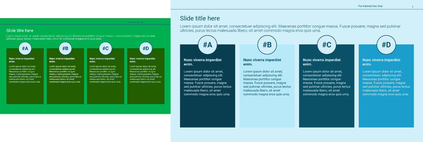
The Four-Section Problem
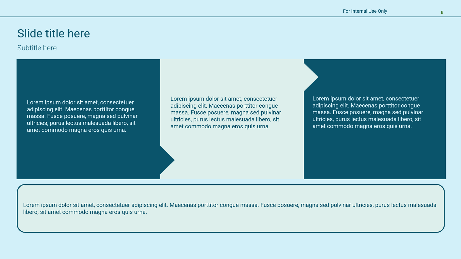
A typical oncology or clinical data slide deck contains at least four structurally distinct section types, each requiring its own visual grammar:
Hero Statement
A large-format, high-contrast callout for key data or outcomes - designed to anchor the slide and orient the viewer immediately.
Comparison Section
Side-by-side or tabular presentation of clinical data, efficacy results, or competitive landscape - requires clear column hierarchy and colour-coded differentiation.
Supporting Evidence
Dense reference data, footnotes, biomarker detail, or HCP quotes - needs smaller typographic weight without being visually buried.
Summary / Takeaway
A visually distinct closing zone for each section - action-oriented language, often with a different background or accent colour to signal transition.
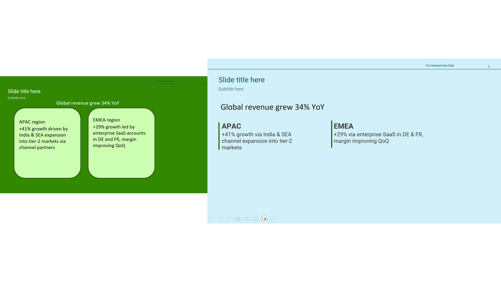
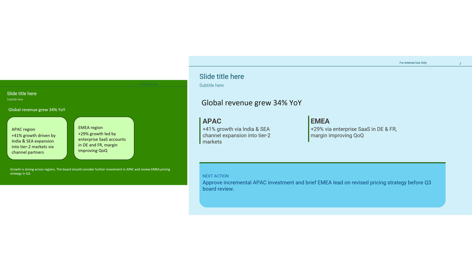
In standard presentation design, a brand colour palette can run consistently through every slide. In life sciences, this approach breaks down. If the hero callout, the comparison table, the supporting data, and the summary all share the same green - or the same navy - the viewer loses the visual signalling system that tells them what type of information they are looking at.
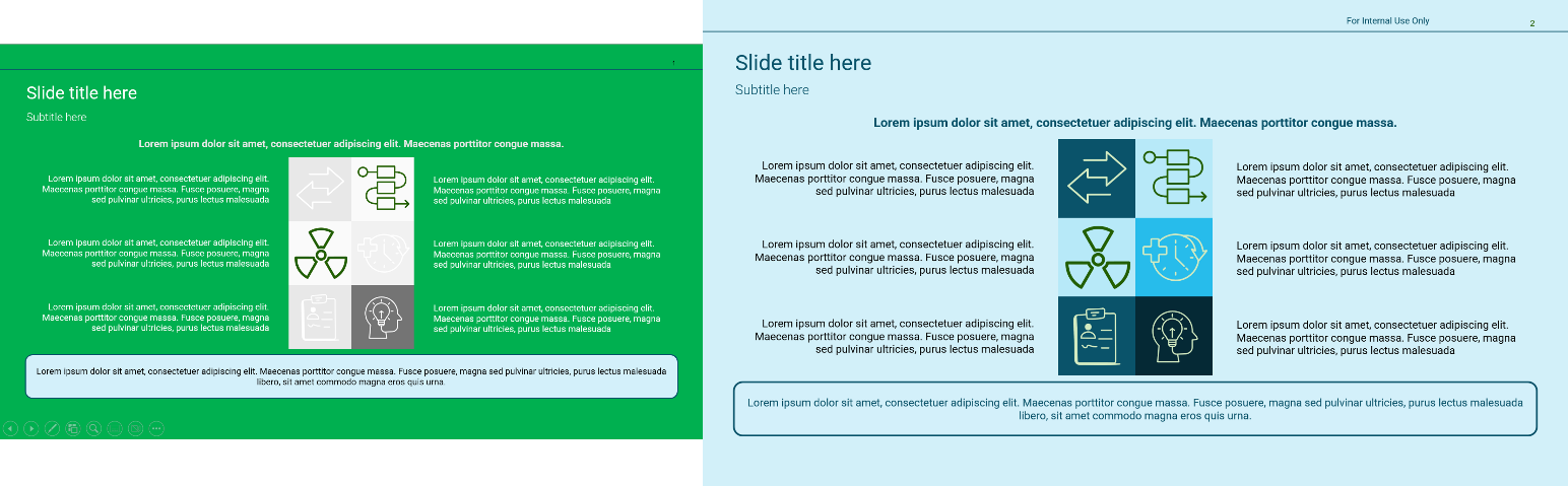 Before After
 Across the decks reviewed by A1 Slides, colour bleed between sections was the single most common structural failure. A slide that looks branded is not the same as a slide that communicates clearly.
 Before After
 Life sciences audiences read slides fast, under pressure, and across markets. Colour zoning is not a stylistic choice - it is a functional navigation system.
The freehand vs. Structured decision:
Freehand template work requires every designer to reconstruct the colour zoning logic, layout hierarchy, and data-placement rules from scratch on each engagement. Without a structured system, these decisions are made inconsistently - and the client deck suffers for it.
Additional Challenges
- Placeholder design must pre-solve spatial allocation for dense clinical data - tables, charts, and footnotes compete for the same real estate.
- Typographic hierarchy must visually separate label from value, category from datapoint, source from claim.
- Brand compliance in life sciences is non-negotiable - every element must sit within regulatory and identity guidelines, even when the content changes from slide to slide.
- Global decks require colour palettes and font choices that survive translation, localisation, and multi-market review cycles.
03 Insight-First Design in Life Sciences
The Methodology That Changes How Clinical Data Gets Read
At A1 Slides, every life sciences engagement is governed by a core principle: the insight is the hero; the design is its guide. This is what we call Insight First Design - and in life sciences, it is not optional. It is the difference between a deck that informs and one that drives a decision.
Life sciences decks suffer from a specific version of what we call the Insight-to-Action Gap.
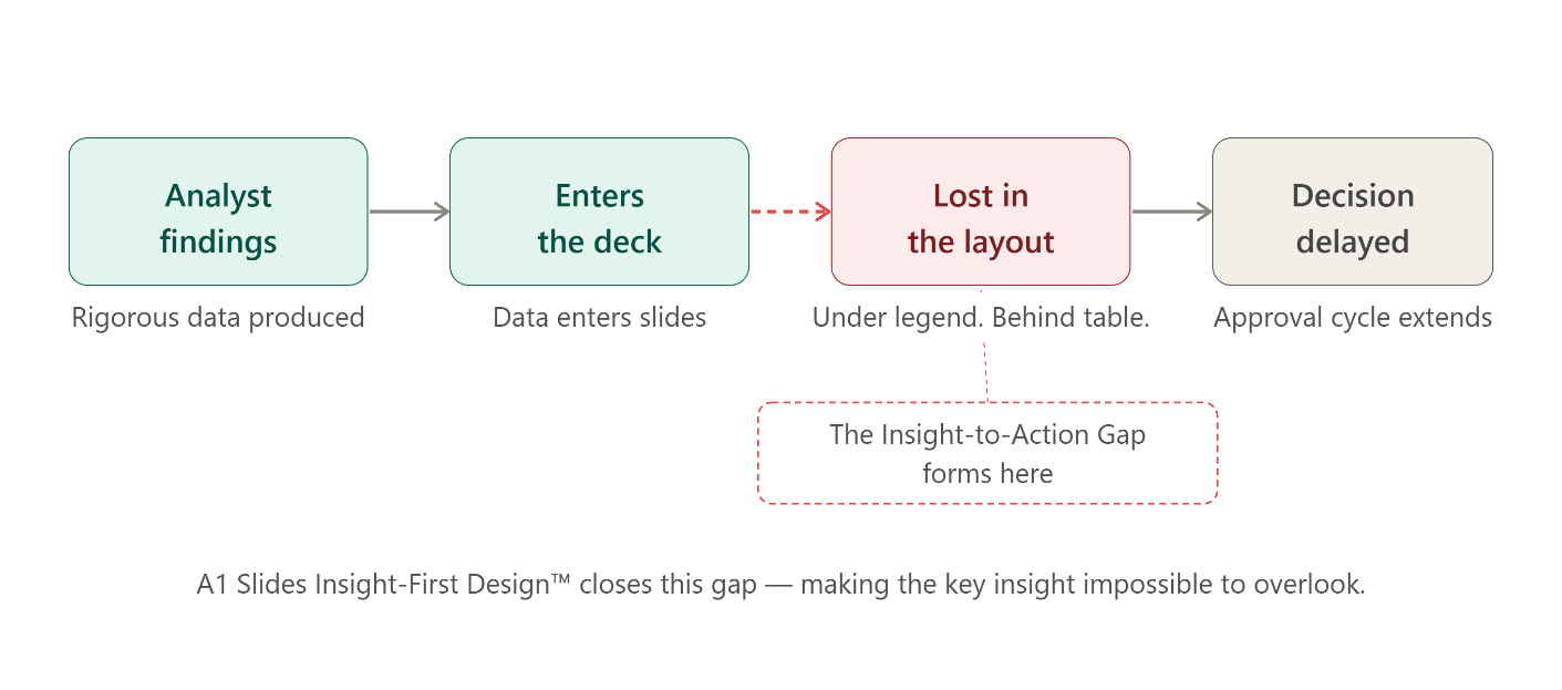
Research teams produce rigorous, high-quality clinical data. That data then enters a slide deck - from Phase III commercial audience briefings to internal evidence reviews - and somewhere between the analyst's findings and the executive's attention, the most important message gets buried.
Under a chart legend. Behind a table. Beneath a footnote. The decision gets delayed. The approval cycle extends. The opportunity cost accumulates.
What Insight-First Design means in practice:
Every slide is engineered around a single, unmissable takeaway. Supporting data is present - but visually secondary. The layout, colour zoning, and typographic hierarchy all exist to direct the reader's eye to that one insight, and then to its implication. Nothing competes with it.
The Three Outcomes A1 Slides Delivers Through This Methodology
Risk Reduction
Clarity at the slide level eliminates misinterpretation at the board level. When the insight is unmissable, decision-makers act on the right information - not their best guess.
Decision Velocity
Executive attention is a finite resource. Insight-First Design is engineered to reduce cognitive load and increase the speed at which leaders absorb, process, and act on clinical or strategic data.
Narrative Coherence
In multi-section life sciences decks - covering methodology, findings, market context, and recommendations - presentation storytelling ensures every section has a single spine that runs from slide one to the final recommendation.
This is not a stylistic upgrade. It is a strategic recalibration of how scientific evidence is communicated to the people who act on it. A1 Slides applies Insight-First Design across every life sciences engagement - from single-slide data visualisations to 200-page integrated reports.
04 Our Approach
A Design System Built for Life Sciences
The answer to the freehand vs. predefined debate is not simply to lock down a template and limit designer freedom. It is to embed the right decisions into the system at a level where designers do not need to reconstruct them - and clients do not need to review them - on every engagement, especially when the final asset is a medical affairs or MSL deck.
The A1 Slides POD Model
Each engagement at A1 Slides is handled by a specialist POD - a small, focused team trained on life sciences content conventions. POD designers are not generalists who occasionally work on pharma decks. They are specialists who have reviewed thousands of biotech slides and understand how clinical data behaves across slide types, section structures, and audience contexts.
Four-Palette Colour Zoning
Every life sciences template system built by A1 Slides is structured around a four zone colour architecture that maps directly to the four section types described above. The palette is chosen to create maximum functional differentiation between information zones, within the client's brand guidelines.
This means:
Predefined Placeholder Architecture
Each placeholder in the A1 Slides system is designed to solve three problems simultaneously:
Spatial
Pre-allocated regions for dense clinical data, with defined proportions that prevent layout collapse when content volume varies.
Typographic
Built-in hierarchy that separates label from value, category from datapoint - without requiring manual formatting on each slide.
Colour
Zone-locked colour assignments that fire automatically by section type, ensuring consistent navigation signals throughout the deck.
The result: designers spend minimum time rebuilding decisions the system has already made. They focus entirely on content precision - placing the right data in the right placeholder, in the right language, for the right audience. For dense endpoints and safety data, that same discipline carries into clinical data visualisation.
05 Outcomes & Impact
Design That Performs at Scale
Across life sciences presentation engagements, A1 Slides consistently delivers three measurable outcomes:
Faster
Design-to-Approval
Predefined systems reduce layout decisions per slide - fewer decisions means fewer revision rounds, particularly for payer engagement decks where evidence review timelines are tight.
Clearer
Stakeholder Comprehension
Colour-zoned sections score higher in stakeholder reviews - audiences navigate to what matters, faster.
Reusable
Scalable Asset
Clients gain a design system, not a one-off deliverable. Global teams use the same template across markets.
The deeper advantage is structural. A template system trained on 10,000-plus biotech slides has colour inconsistency errors removed at the system level - not caught in review. The palette is locked. The zones are defined. The hierarchy is built in. What remains is content - and content is where the client's expertise should be focused.
06 FAQ
Life Sciences Presentation Design FAQs
Why is life sciences presentation design different from standard presentation design?
Life sciences decks must simultaneously serve scientific, executive, and regulatory audiences - each with different tolerances for density and different definitions of clarity. A single oncology slide may need to carry hero callouts, comparison tables, biomarker data, and summary takeaways, all within MLR-compliant formatting. Standard design tools and generalist designers are not built for this.
What is colour zoning in life sciences presentation design?
Colour zoning is the practice of assigning distinct colour treatments to each structural section type in a clinical deck - hero statements, comparison sections, supporting evidence, and summaries. When all sections share the same palette, the viewer loses the visual navigation system that tells them what type of information they are reading. Colour zoning is a functional communication tool, not a stylistic choice.
What is the four-section problem in pharma slide design?
Most clinical and pharma decks contain four structurally distinct content types: a hero statement for key data callouts, a comparison section for clinical data tables, a supporting evidence zone for references and biomarker detail, and a summary takeaway. Each requires its own visual grammar. When all four are designed with the same layout logic, the deck loses the hierarchical clarity that clinical audiences need to navigate quickly.
What does Insight-First Design mean for life sciences presentations?
Insight-First Design is A1 Slides' methodology for engineering every slide around a single, unmissable takeaway. Supporting data is present but visually secondary. Layout, colour zoning, and typographic hierarchy all direct the reader to the one insight that matters - and then to its implication. In life sciences, this reduces the Insight-to-Action Gap: the delay between clinical findings and executive decisions caused by presentations that bury the key message.
What is predefined placeholder architecture in clinical deck design?
Predefined placeholder architecture means building spatial allocation, typographic hierarchy, and colour zone assignments into the slide template itself - so designers do not reconstruct these decisions on each engagement. For life sciences clients, this means faster production, fewer revision cycles, and consistent visual standards across global teams using the same template across markets.