The Life Sciences
Presentation Report
The Perception Science Behind Clinical Data Communication
More accurately read: aligned bars vs pie slices
Research figures fail colour-blind readers
Of approved content rarely or never used
The State of Clinical Data Communication 2026
How Life Science Teams Can Make Evidence Land in the Room
Life science teams invest months generating robust evidence, yet far less attention goes to whether that evidence is read correctly once it reaches a slide. A pie chart can be numerically right and still mislead. A Kaplan-Meier curve can look authoritative and still lose the context that prevents misreading. This report brings together peer-reviewed research and industry benchmarks, and turns them into a practical standard for clinical data slides.
Get the Full Report
Fill in your details to access the complete research report
What’s Inside the Report
The Perception Hierarchy
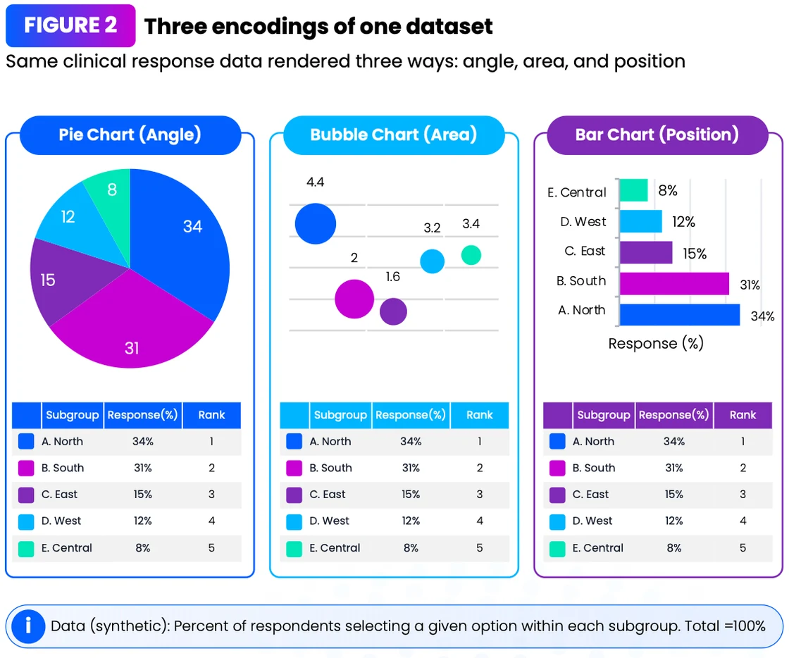
Which chart types audiences actually read accurately, and why pie charts cost precision.
The Kaplan-Meier Problem
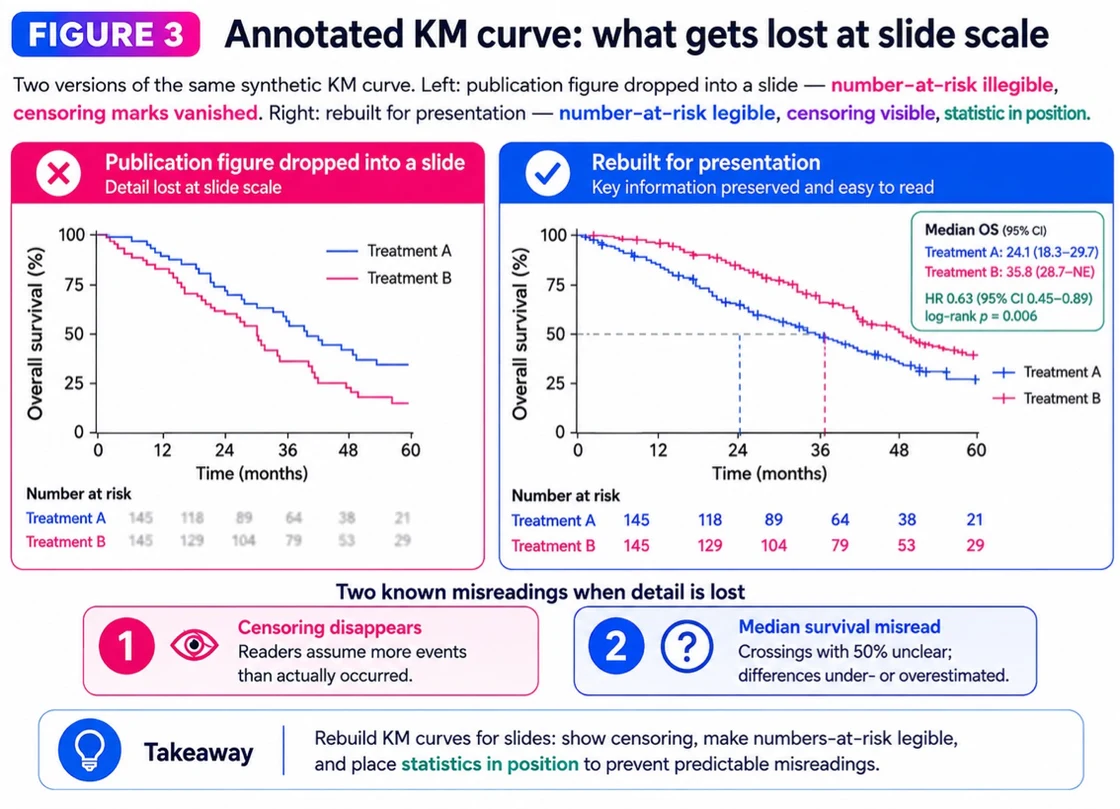
Why pasted KM curves get misread, and the three elements that prevent it.
Axis Truncation
Why flagging a truncated axis doesn't stop readers overestimating differences.
Colour & Accessibility
How rainbow heatmaps distort data and exclude colour-blind readers.
The Operational Layer
MLR review cycles, content utilisation and where time is really lost.
A Practical Standard
A 7-point standard for clinical data slides, plus an editor's view from Vaidehi Shukla.
Who Should Read This Report
Life Science Consultants
Partners and teams presenting evidence to pharma and biotech clients
Medical Affairs & Scientific Comms
Responsible for accurate, compliant clinical data communication
Market Access & HEOR Teams
Building value stories for payers and access decisions
Commercial & Brand Strategy Leads
Turning research into decisions at advisory boards and leadership meetings
Key Findings from the Report
~2×
Position on a common scale is judged about twice as accurately as angle. The pie chart in your deck is quietly costing precision.
Source: Cleveland & McGill (1984)
56.2%
Baseline accuracy reading Kaplan-Meier plots among doctors and medical students. Rebuild KM curves, don't paste them.
Source: arXiv 2511.08332 (small study, n=32)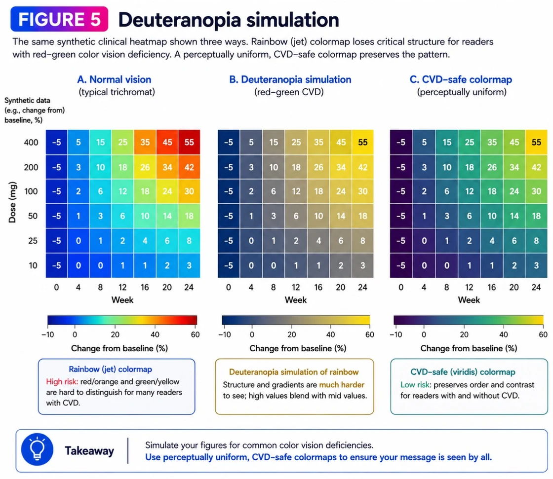
12.8%
Of biology research figures are problematic for red-green colour-blind readers, and they end up in congress decks.
Source: eLife (2024)Ready to Make Your Clinical Evidence Land?
Partner with A1 Slides for decision-ready life science presentations
The Dose
The briefing life science consultants reach for first
Funding signals, regulatory moves, and the presentation strategies that win deals — straight to your inbox, monthly.