Asian Paints — BOI Annual Dealer Event
The Vivid Design
Confluence
A 100+ slide flagship deck, ten themes narrowed to one, and a hall, stage and story built around it — designed end-to-end in four days, from A1 Slides’ office in India, in sync with Sydney’s clock.
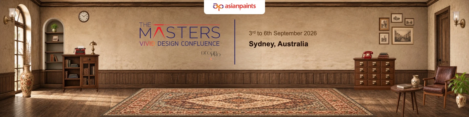
- Client
- Asian Paints — Nilaya / Arazzo / DecorPro / White Teak
- Event
- The Masters — Vivid Design Confluence
- Where
- Sydney, Australia
- Presented by
- Director, Asian Paints
01 — The Brief
A director-level deck, built against a very unforgiving clock
BOI brought us in to build the flagship presentation for Asian Paints’ Sydney event — a deck that would be presented on stage by an Asian Paints Director to the brand’s global architect and design partners. There was no room to treat this as “just a PPT.”
100+
slides across trends, product launches, brand collaborations and a curated narrative arc
4 days
from brief to final, presentation-ready deck — no exceptions on the deadline
3 screens
multiple screen sizes on a single stage, with the deck reframed to read correctly across all of them
Sydney time
turnaround windows and review calls run against Australian hours, not IST
The stakes were real. This was going up on stage in front of Asian Paints’ global design partners — Atelier Oi, Monica Armani, Sabyasachi, Christophe Delcourt among them — presented by a Director. Every slide had to hold up at that level.
The scope kept widening. What started as a deck grew into a full presentation experience — the theme had to carry through the stage design, the hall layout and the props on the table, not just the slides.
The brief kept moving. Changes were still landing right up to the final moment, all handled from A1 Slides’ own premises with no remote or on-location working permitted — this called for a team that could hold structure and quality steady while the content underneath kept shifting.
02 — The Approach
Ten themes on the table. One theme built into an entire room.
Before a single slide was locked, the A1 POD explored ten distinct creative directions for the event — each a different lens on the same brief. “Vivid” was chosen as the thread that could hold the deck, the design trends, and the room together.
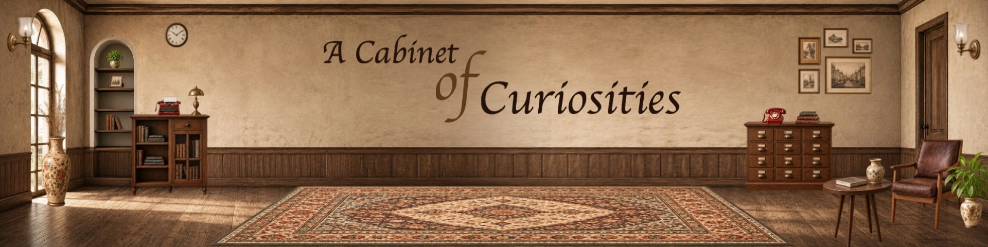
- Cabinet of Curiosities
- Vivid Design Confluence ✓
- Material Memory
- Next Dimension
- Continuum
- + 5 more directions
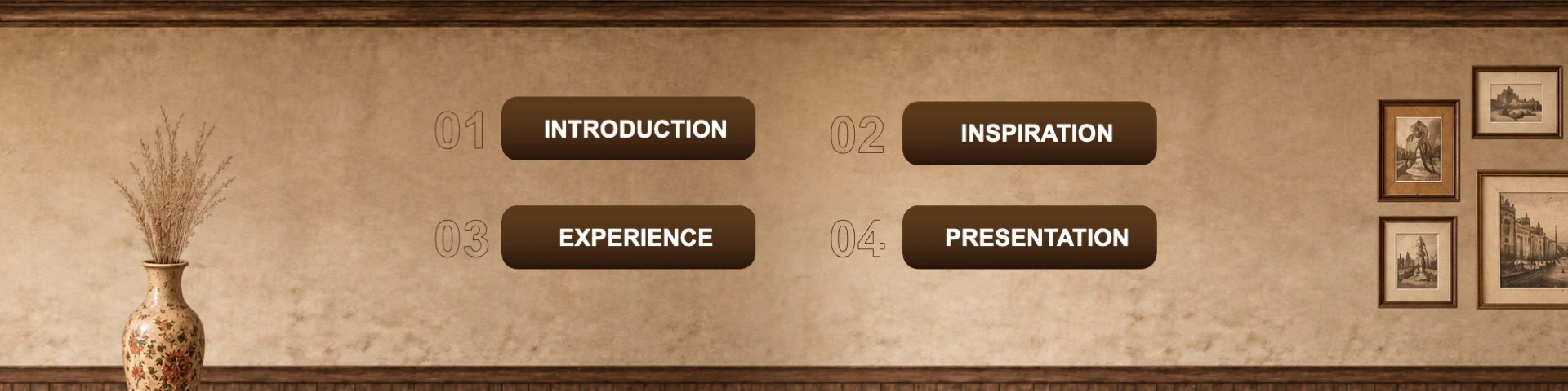
Deck
100+ slide narrative — introduction, inspiration, trend research, product reveals, closing
Stage
Design language carried onto the stage backdrop and speaker set
Hall
Layout and wayfinding of the venue tied back to the theme’s visual world
Props
Tabletop elements (down to miniature “cabinets”) built to match the story being told
03 — The Work
Not just a design deck — a story told through motion
The brief was a trend report: multi-sensory design, enduring architecture, renewed futures, dozens of Asian Paints’ own brand launches woven in. The A1 POD’s contribution was to stop treating that as a list of slides and instead give it a spine — using animation and sequencing to carry the audience through a single unfolding story rather than a stack of topics.
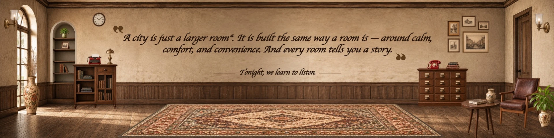
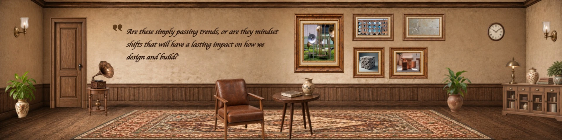
“The current benchmark isn’t beautiful — it’s a space, or a deck, that feels good because everything is working on multiple registers at once.”
04 — Technical Overview
Built for the room, not just for the screen in front of us
A stage this size doesn’t forgive a deck built to generic defaults. Every technical decision — canvas, asset, layout, split — was made against the actual venue, not a 16:9 assumption.
Canvas matched to the screen, not the other way around
Page size and aspect ratio were set to the actual dimensions of the stage screens, so nothing was stretched, letterboxed or re-cropped on the day — what we designed is exactly what filled the wall.
Every antique element, built in-house
The vases, gramophones, frames, clocks and sketched furniture that carried the nostalgic mood weren’t stock downloads — each was designed from scratch by the design team to hold up on a screen many metres wide.
Content placed for where the room was actually looking
Slide layouts were adjusted against the stage seating plan as it evolved — content shifted position so it stayed in the sightline of the audience and the head table at each point in the run of show, not just centred on a default template.
Reframed for three screens, not one
The stage ran three separate screens to cover a large hall. Slides were recomposed so key content read correctly across the split — legible and balanced whether the crowd was looking centre-stage or off to either wing.
05 — Refining Live, Under Pressure
Client feedback landed close to the wire. It got answered, not absorbed as delay.
With days to go, the brand team asked for a real shift in register — pull the visual language back from theatrical and ornamental toward something minimal, understated and nostalgic, so the content stayed the hero. This is the kind of note that can derail a timeline; instead it was worked through directly, in the same four-day window.
Feedback Received
- Cabinet of Curiosities read as theatrical / palace-like — needed to feel discovered, not grand
- Ornamental frames and side decoration were competing with the content
- The Vivid template’s design elements were overpowering the message
- Sydney skyline needed to stay present, but subtle
How It Was Resolved
- Simplified frames and backgrounds; removed side ornamentation so content led every slide
- Explored a cabinet/drawer-opening transition to keep the sense of discovery without the grandeur
- Rebalanced the Vivid template so design supported the message instead of competing with it
- Folded the Sydney skyline back in as a quiet visual anchor, not a dominant graphic
From the client’s brand team
“So, in short, across both directions, the ask is to simplify, reduce the ornamentation and let the content breathe, while retaining enough character to make the PPT feel distinctive.”
06 — Outcome
A deck that carried a Director on stage — with the theme built into the room around it
The Masters — Vivid Design Confluence opened in Sydney on schedule, with a deck, stage and hall built off the same design language, presented at Director level to Asian Paints’ global partner network.
100+ slides
delivered presentation-ready in a 4-day window
10 → 1 theme
explored, tested and committed to across deck, stage and hall
Live to the last mile
brand-level creative feedback absorbed and resolved inside the same deadline
Beyond the deck
a story told through motion, not just a set of slides
The deck’s own closing slide asked, “Where do we go from here?”
For A1 Slides, it’s the next high-stakes room, the next impossible clock — and the same standard.