When McKinsey present it’s not a powerpoint presentation but a decision making narrative. It is not just another data dump presentation but designed strategically to help board reach a decision.
Most presentations that we receive are data heavy, tables, facts, figures and charts yet if you go through them you probably end up more confused and the problem is not the data but the way data is presented.
You see to understand data in 10 excel files would leave no space for mind to conclude anything out of it, if not put in context, data aligned to help solve a problem or reach to multi million decisions
This is what exactly we do at A1 Slides using our Insight First Design, we partner with top-tier management consultancies to scale their visual output.
In this playbook, we break down the exact architectural rules used to design "McKinsey-style slides" and how you can apply them to your next high-stakes boardroom presentation.
Rule 1: The Pyramid Principle (Top Down Logic)
Barbara Minto first suggested the Pyramid Principle and later that became the norm for consultancies to present to their clients. This principle is very different to a traditional presentation using "bottom-up" logic where they show all their research, explain their methodology, and finally reveal the conclusion on slide 40.
McKinsey-style presentations use Barbara Minto’s Pyramid Principle which basically says, you must deliver the conclusion first, followed by the supporting arguments, and finally the granular data.
How to design for this:
The Executive Summary: Your first 3 slides must contain the entire strategic recommendation. If the CEO leaves the room after 5 minutes, they should still know exactly what to do.
The Vertical Logic: If a stakeholder reads only the title of a slide, and then looks at the chart below it, the chart must directly prove the title. No extra fluff.
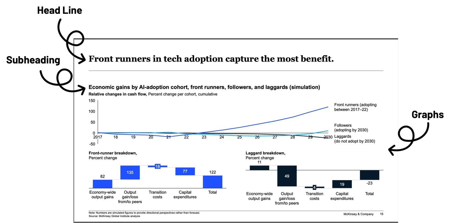
Rule 2: Action Titles Over "Topic Titles"
The most common mistake in corporate presentations is the "Topic Title."
Bad (Topic Title): "Q3 Financial Performance" or "Market Analysis."
Good (Action Title): "Q3 Revenue dropped 14% due to supply chain bottlenecks in APAC, requiring immediate vendor diversification."
In a McKinsey-style deck, the slide title is the most important real estate on the page.
It must state the "So What?" The "Read-Through" Test: If you strip away all the charts and graphics and only read the slide titles from slide 1 to 25, it should read like a cohesive, persuasive essay. We call this the "Narrative Spine."
Executive Resource: Want to see these rules in action? Download our report The Executive Presentation Outlook (Requires Business Email)
Rule 3: The "Ghost Deck" (Structure Before Design)
This is where most companies miss. You should never open PowerPoint until your logic is flawless. Top consultants use a method called the "Ghost Deck" or "Dot-Dash Storyline."
Before any visual design begins, you map out the presentation on paper or a simple text document:
At A1 Slides, our Insight First Design™ methodology starts here. When enterprise clients send us a 100-page research dump, we don't start making it "pretty." We build a Ghost Deck to ensure the strategy is airtight before a single pixel is placed.
Rule 4: MECE Data Visualization
Consulting slides are famous for being dense, but they are never cluttered. They follow the MECE principle: Mutually Exclusive, Collectively Exhaustive. When visualizing data on a slide, every element must have a distinct purpose (Mutually Exclusive), and together they must tell the whole story (Collectively Exhaustive).
Visual Rules for Consulting Decks:
Zero "Chart Junk": Remove 3D effects, background grids, and unnecessary legends.
The "Call-Out": If you use a bar chart showing 10 years of data, use a distinct accent color (like a bold blue or coral) to highlight the one specific year that proves your Action Title.
Tracker Bars: Use a tracker (a small highlighted navigation bar at the top or bottom of the slide) so the audience always knows where they are in the broader agenda.
Rule 5: Maximizing "Signal-to-Noise" Ratio
Executive cognitive load is your biggest enemy. Our “The Executive Presentation Outlook 2025” highlights this in detail. If an executive has to spend 30 seconds figuring out how to read your chart, you have lost their attention.
A McKinsey-grade slide acts as an information filter. It removes the "noise" (data that is true, but irrelevant to the decision) and amplifies the "signal" (the exact insight driving the strategy).
How to Scale Consulting-Grade Presentations
Building McKinsey-style decks takes an immense amount of time. A standard 30-slide strategy deck can take a consultant 40 to 60 hours of structuring, formatting, and charting.
This is a massive misallocation of expensive talent. A Strategy Director should be analyzing markets, not aligning text boxes at 2:00 AM.
This is why top-tier consulting firms and Fortune 500 strategy teams partner with A1 Slides.
We don't just "beautify" slides. Our designers are trained in the Pyramid Principle and business logic. You hand us your rough "Ghost Deck" or data dump, and we deliver a high-fidelity, boardroom-ready presentation that commands executive attention.
Ready to elevate your next strategic review?
Ready to elevate your next strategic review?
Stop wasting your team's hours on formatting. Partner with an agency that understands business strategy.