
The 63-Slide Trap: Why Executives Ignore Comprehensive Research
The 63-Slide Trap: Why C-Suite Executives Ignore Comprehensive Research For decades, the management consulting industry
Ever wonder why McKinsey and BCG presentations look so damn good? After designing 15+ years creating presentations for CEOs and business leaders, I’ll share the secret sauce for crafting presentations that nail it in McKinsey style
Instead of using a lot of jargon, font style, and nitty–gritty, I suggest a simpler and more memorable analogy to help you design a McKinsey-style deck without pushing yourself hard.
The best way of doing this is to think like a Movie Director
So like a Director, you think of your audience first. It’s not about ‘your satisfaction’ it’s about your audience’s entertainment/objective. You need to look into your target audience in this case it’s CEOs, Board members and decision–makers.
And there is a common trait you find in all.
So when you know your audience it becomes easy ( and your job) to present anything which can fulfil all parameters of their attention.
Below is the magic formula to do that
Below are some pro level hacks to get your presentation as close as possible to McKinsey Style
The Magic Formula
This formula works every time, whether it is for McKinsey, EY, or Deloitte. Why, cause the target audience shares a similar trait and for all these companies their target audience are basically the same.
Pro-Level Slide Design Hacks
Ok, so far in theory you would understand how McKinsey and other consultancy firms prepare their presentation but it’s time where rubber meets road. You need to learn how to prepare your own McKinsey-style deck
Once you know how McKinsey Style Slides works , you know how the McKinsey style Presentation works and you can stop here and try these hacks. However if you interested in learning a little deep and moving from ‘How’ to ‘Why” then keep on reading. Because I am gonna talk about the psychology behind these slide designs, reason why they make total sense for McKinsey or any other consultancy firm and for that matter you.
Traditional presentations often follow a Problem-Argument-Solution (PAS) format. But in consulting, we flip this approach on its head – because C-suite audiences think differently.
When presenting to senior decision-makers, lead with solutions. Why? Because executives need to quickly grasp the “so what” before diving into details.
Here’s how top consultancies structure their narrative
This approach respects executives’ time and decision-making style.
They want to see the destination before reviewing the journey that got you there. Your presentation becomes more compelling when it aligns with how senior leaders process information and make decisions.

Repeat this sequence for each key insight you want to present. Structure flows from high-level conclusions to detailed supporting evidence, making your presentation both executive-friendly and logically compelling.
Think of it as an inverted pyramid: start with the big picture (what matters most to executives) and progressively dive deeper into supporting details. Your closing slide should reinforce key actions or decisions needed.
Insights are findings from your analysis that reveal
They come from thorough research and data analysis, forming the critical bridge between your initial findings and proposed solutions.
For example, after studying customer behaviour data, you might discover that “90% of users abandon their shopping cart when shipping costs appear in the final step“—this insight would lead to your solution of displaying shipping costs earlier in the purchase journey.
Strong insights require rigorous analysis and often uncover non-obvious patterns that drive real business impact. While solutions might seem straightforward in hindsight, the deep analytical work needed to uncover these actionable insights is what sets top consulting work apart.

For example, if our conclusion is to launch operations in Germany first, our supporting arguments would be strategically arranged:
Notice how each argument builds upon the previous one – from market opportunity to technical readiness to operational capabilities. This structured approach creates a compelling narrative that makes our conclusion feel inevitable, rather than just listing random facts.
This strategic arrangement of arguments is what sets apart persuasive presentations from mere data dumps.
Stories are powerful because they naturally package data and arguments in a way that’s easy for listeners to understand and remember. Think of a story like a pill capsule – it delivers the important content in a digestible format.
As consultants, we need to weave stories into our presentations. These aren’t traditional “once upon a time” tales, but rather a logical flow of information that carries through to the end.
You might wonder why I suggest developing your storyline before creating individual slides. Here’s why: A storyline is like a thread holding pearls together in a necklace. Just as beautiful pearls are useless without a thread connecting them, your data and arguments need a clear storyline to become meaningful. The storyline puts everything in the right order and shows how each piece connects.
How does the storyline work?
Just check out the following example. I believe by going through this you will understand the importance of the storyline and see the storyline in action
This random order might overwhelm the audience with disconnected facts.
Takeaway
By weaving a storyline, you guide the audience logically through the problem, solution, and impact. It ensures that each slide feels connected, making the data and arguments more compelling and memorable.
There are a few key components of a slide
The image below shows a typical slide from McKinsey
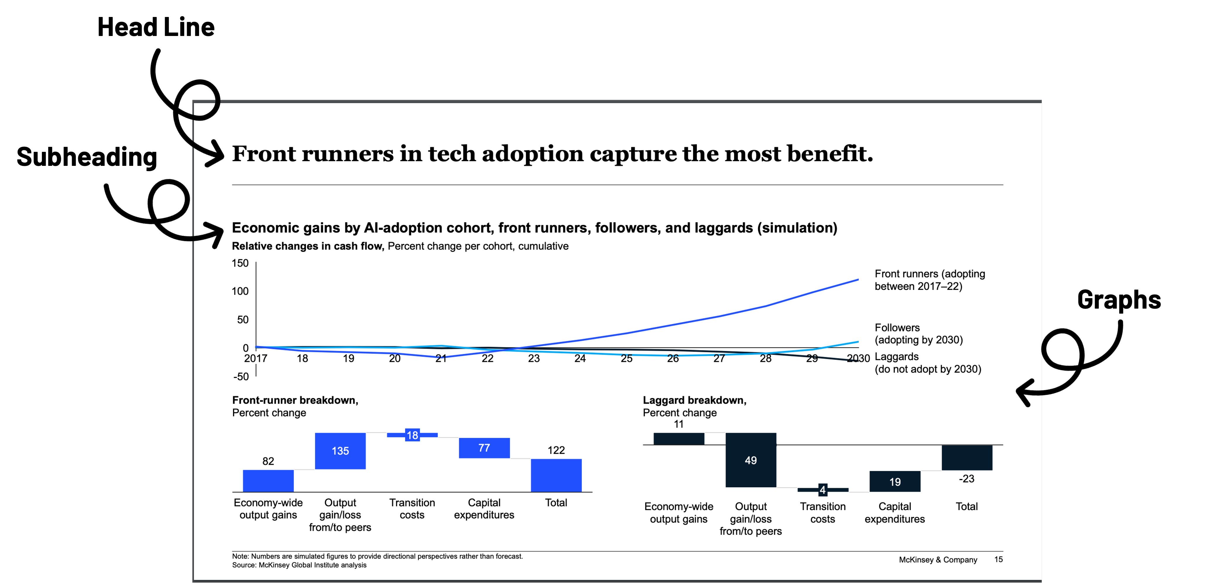
Here’s the thumb rule of slide design in McKinsey Style PPT
Your slide titles should tell an important part of the story. Even if someone reads only the titles without the data or images, they should still grasp the overall message.
Each title should connect to the storyline, building clarity slide by slide.
Subheadings, Data, or Arguments
The next step is ensuring your subheadings, data, or arguments support the title. Weak data or arguments can undermine the credibility of your slide and the entire deck.
This is why the golden rule of slide design is:
The title is that message, and it must be fully justified by the content on the slide.
Think of your title as part of the story (a pearl), and the supporting data as the thread that holds it together.
They play a critical role too! In next section, I’ll guide you on how to decide what belongs in the slide body.
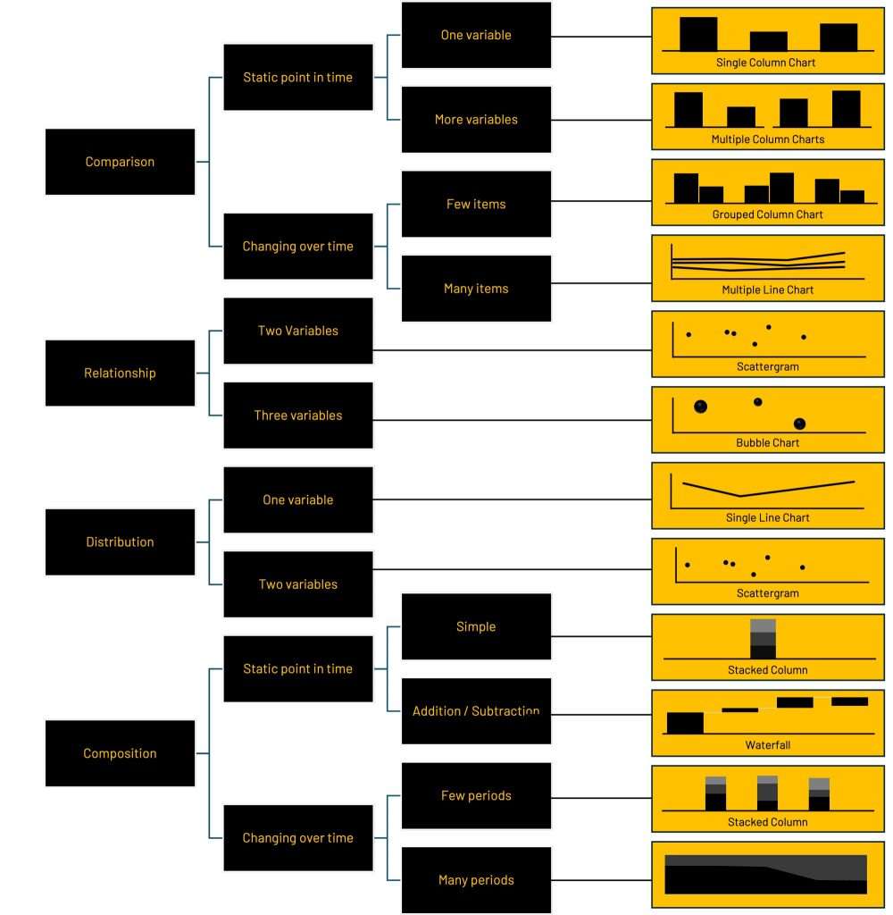
Have you ever stuck, staring at a blank slide and figuring out the best chart or visualization can be overwhelming? How do you know you’re choosing the right one?
Don’t worry—there’s a science to it, and I’m here to simplify it for you.
Imagine you’ve just completed a sophisticated analysis, and now it’s time to present your findings. It’s tempting to include all the complex details to showcase your hard work.
But here’s the truth:
Your slide should use the simplest chart with the least amount of data required to support your action title. Think of it as creating a “minimum viable chart”—just enough to convey your point clearly and effectively.
Charting doesn’t have to be complicated. In fact, there are only four types of insights you can visualize:
Comparisons
Show how one dataset is similar to or different from another.
Example: Comparing Company A’s revenue with Company B’s revenue.
Relationships
Show how changes in one dataset correspond to changes in another.
Example: Ice-cream sales increasing as temperatures rise.
Distributions
Show how data is spread over time or another variable.
Example: The range of salaries across a group of employees.
Compositions
Show the breakdown of a dataset into its parts.
Example: The underlying drivers of cost growth.
That’s it! Once you know whether you’re showing a comparison, relationship, distribution, or composition, you can use a simple decision tree to pick the perfect chart.
In this section you ll learn how to write effective executive summaries. The Pyramid structure we discussed earlier proves valuable here too – it’s a universal approach used by leading consultancies worldwide.
Lead with Your Main Message
Understand Your Audience
Structure for Impact
Leading consultancies use this approach because it respects their audience’s needs – delivering essential insights quickly while providing the depth needed for informed decision-making.
Here is one example
Notice how the Title / Bold first line tells the complete summary of the slide, even if you read the first title alone you will get to know the point that this slide is making.
Pyramid Structure for Executive Summary
The executive summary should encapsulate the entire storyline of the slide deck, adhering to the pyramid structure.
This approach breaks down the content into
Provides the baseline knowledge necessary to understand the context and origins of the problem.
Highlight the core problem and its significance.
Offer solutions and actionable recommendations.
Design Bold Headlines
Maintain Narrative Flow
Apply the Pyramid Structure
This approach ensures your executive summary is both powerful and accessible, delivering key insights quickly while maintaining depth and clarity.
Structure That Sells
The 63-Slide Trap: Why C-Suite Executives Ignore Comprehensive Research For decades, the management consulting industry
The “Zero-Fail” Standard: Selecting an End-to-End Event Presentation Partner for Global Product Launches Executive Summary