Why Your Presentation
Pointer is Killing Your Message
(And What to Do Instead)

Before you spend even a minutes to read further, you must know the criteria of selection
Remember that feeling? You’re sitting in a business presentation, trying to pay attention, when suddenly… a frantic laser dot dances across the screen. Or worse, a presenter jabbing a literal stick at their slides like they’re conducting an orchestra with a blunt instrument. Sound familiar? We’ve all been there, and let’s be honest, it’s distracting, isn’t it? ( I personally feel rude also )
It might seem helpful to point things out, but here’s the uncomfortable truth: that presentation pointer – whether it’s
a laser pointer,
a stick, or
even your finger
– could be unintentionally sabotaging your message and putting your audience to sleep. Yes, really! It’s a common presentation mistake that many presenters make.

The Silent Saboteur: Why Pointers ( Like lesar, stick or finger ) Aren't Your Friend in PowerPoint Presentations
Think about it. When you’re constantly aiming a pointer, where’s your focus? On the screen, right? And when your eyes are glued to the visuals, you’re losing crucial eye contact with your audience. That direct gaze is what builds connection, conveys confidence, and keeps people engaged. Without it, you might appear disengaged, or worse, like you don’t fully know your material. This is key for effective public speaking.
Beyond the loss of connection, a shaky laser beam or an erratic stick can be incredibly distracting.
Your audience’s eyes are drawn to the movement, not the content. It can even cause eye strain or make people feel a little dizzy trying to follow a rogue red dot. It’s like a tiny, annoying performance happening right next to your actual presentation.
The deeper issue isn’t the pointer itself, but often, what it’s compensating for. Many presenters lean on pointers as a crutch.
- Are your slides packed with too much text?
- Do you find yourself pointing to bullet points you’re essentially reading aloud?
That’s a red flag.
It suggests your slides might be too busy or you’re relying on them to carry the entire load, rather than letting you be the star. Effective presentations put the speaker front and center, with visuals serving as powerful, silent partners, not replacements for your voice and presence. This is a core principle of good presentation design & often PPT Experts share this with the presenter.
TL;DR: Pointer Problems vs. Better Presentation Practices
| If You're Tempted to Use a Pointer... (The Problem) |
Do This Instead! (The Solution) |
Why It's Better |
|---|---|---|
| Distracting Laser/Stick Movement | Verbal Cues & Static Highlights | Keeps audience focus on you and content, not a dancing light. |
| Loss of Eye Contact with Audience | Maintain Direct Eye Contact | Builds connection, trust, and conveys confidence. |
| Jabbing at Text-Heavy Slides | Declutter Slides (Less is More!) | Prevents audience from reading instead of listening; slides become visual aids. |
| Overwhelming Audiences with Complex Info | Build Slides Incrementally | Guides audience through information step-by-step, improving comprehension. |
| Compensating for Lack of Preparation | Practice, Practice, Practice! | Boosts your confidence and allows for natural, engaging delivery. |
| Relying on Pointer for Focus | Master Your Delivery & Presence | Makes you the compelling focal point, enhancing your expertise and impact. |
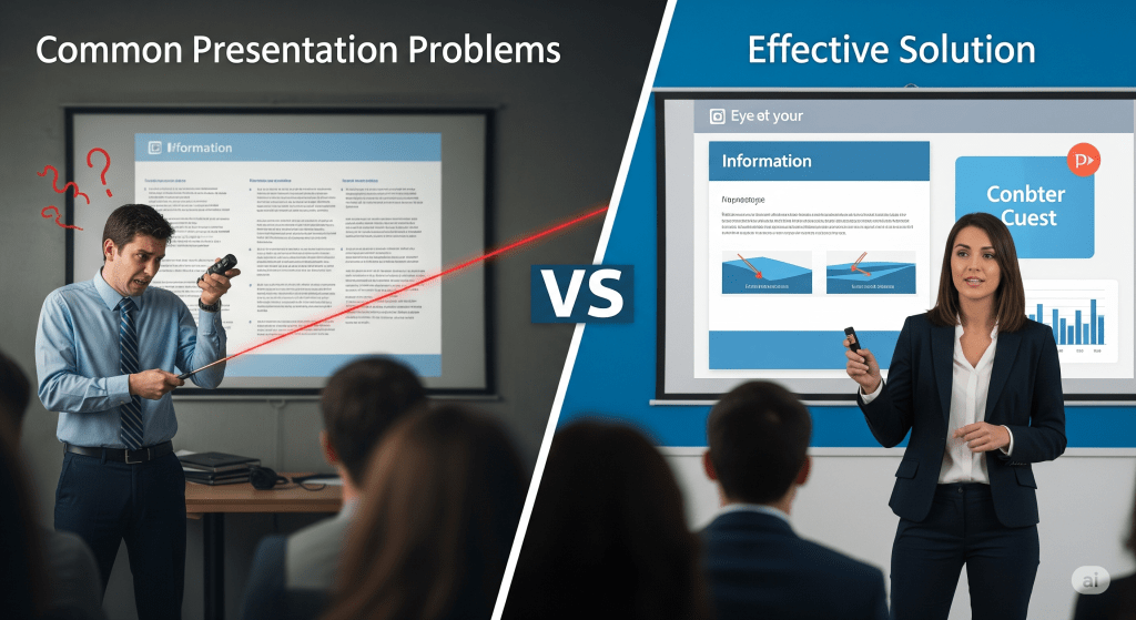
Ditch the Stick, Master the Message: What to Do Instead for Engaging Presentations
So, if the pointer is out, what’s in? The good news is, there are far more powerful, elegant, and audience-friendly ways to guide attention and deliver a memorable presentation. It’s all about making your message the hero and your visuals the supportive cast. And this is where a good PPT Design Agency comes into picture
Here’s how you can ditch the pointer and truly elevate your PowerPoint presentations for better audience engagement:
1. Declutter Your Slides:
Less is ALWAYS More for Impactful Presentations
This is paramount.
2. our slides are visual aids, not your script.
If your slides are packed with dense paragraphs or endless bullet points, your audience will instinctively start reading, not listening. And when they’re reading, they’re not engaging with you.
3. Simplify, simplify, simplify.
Think of your slides as billboards: quick, impactful visual cues that reinforce your words, not replicate them. For complex data, consider an accompanying handout after your talk, not on the slide itself.
4. Guide with Your Voice, Not Your Hand.
You have a powerful tool already: your voice! Instead of jabbing at the screen, use clear verbal cues. “As you can see in the top-right chart…” or “Let’s look at the green segment of this graph…” These phrases naturally direct attention without the visual distraction of a pointer. Referencing colors, numbers, or specific shapes on your slide works wonders for audience focus.
5. Build Your Story, One Element at a Time.
Imagine a detective revealing clues one by one. That’s how your slides should often unfold. Instead of presenting a complex chart or diagram all at once, use animation (sparingly and intentionally!) to bring in elements as you discuss them. This “build” approach takes your audience on a journey with you, preventing overwhelm and keeping them curious. They’ll absorb information incrementally, rather than being hit with a visual wall. This technique is crucial for storytelling in presentations.
6. Smart Visual Design is Your Best Pointer.
Your slide design itself can be the most effective “pointer.”
- Strategic Highlights: Instead of a moving dot, use a subtle, static highlight directly on the slide. A faint yellow circle or a slightly bolder border around a key element can draw the eye precisely where you want it, and it stays put! This can be easily implemented using PowerPoint design tips.
- Color-Coding: If you have a graph, use distinct colors for different data sets and refer to those colors verbally. “Notice how the blue line represents growth…”
- Clean Layouts & High Contrast: Simple, clean layouts with strong contrast ensure readability. When your visuals are clear, there’s less need to point anything out. Principles of Effective Presentation Design
7. Be the Expert: Master Your Delivery and Presence.
You are the presentation. Your confidence, your voice, your body language – these are your most compelling tools. Maintain consistent, natural eye contact with different sections of your audience. Use purposeful, open gestures that align with your message. Vary your tone and pace to keep things dynamic. When you embody expertise and enthusiasm, your audience will naturally focus on you, negating any perceived need for a pointer.
8. Practice, Practice, Practice.
This is the secret sauce. The more you rehearse, the more comfortable and natural you’ll become with your material. When you know your content inside and out, you won’t need to glance at the screen or use a pointer as a security blanket. Thorough preparation allows you to deliver your message smoothly, confidently, and with genuine conviction, keeping your audience hooked. Consider recording yourself to identify areas for improvement in your presentation delivery.


The Takeaway: It's About Connection, Not Control – For Truly Professional Presentations
Ultimately, a great presentation isn’t about controlling where your audience’s eyes are with a stick or a laser. It’s about building a connection, conveying a clear message, and empowering your audience with insights. When you ditch the pointer, you force yourself to create stronger slides and to become a more engaging, present, and impactful speaker.
So, next time you’re about to grab that pointer, pause. Ask yourself: “Does this truly enhance my message, or is it a crutch?” Often, the answer will be the latter. Put it down. Trust your voice, trust your design, and trust your ability to connect. Your audience (and your message!) will thank you. For truly professional presentation design services that prioritize your business success, consider strategic partners who guide you beyond just fulfilling requests.
Yes, here are some simple FAQs for the blog post, designed to directly address common reader questions and reinforce key takeaways:
Frequently Asked Questions (FAQs) for Presentation Pointers while presenting
Need help designing a presentation that builds trust?
A1 Slides is a company with 15 years of experience designing presentations for over 1000 clients in 50+ industries, including major brands like Honda, Nokia, and Abbott. We specialize in creating strategic presentations that do more than just look good—they achieve your business objectives. Contact us to start the conversation.
Related Post


Real Estate Presentation Storytelling
Beyond the Blueprint: How to Use Storytelling to Emotionally Connect