Using Icons Effectively in Presentation Design: Enhance Clarity & Impact
Icons are small but mighty tools in presentation design. When used thoughtfully, they help convey ideas quickly, break up text-heavy slides, and guide your audience’s attention. But using icons without purpose or consistency can confuse viewers or clutter your slides. Mastering icon usage can elevate your presentations from ordinary to outstanding.
Why Use Icons in Presentations?
Simplify Complex Ideas: Icons can visually represent concepts, making them easier to grasp.
Enhance Visual Appeal: They add visual interest and break up monotony.
Guide Attention: Icons act as signposts directing viewers to key points.
Support Branding: Customized icons can reinforce your brand’s style and tone.
Best Practices for Using Icons
Choose Relevant Icons: Select icons that clearly relate to your message.
Maintain Consistency: Use a consistent style (line, filled, flat, 3D) throughout.
Limit Number of Icons per Slide: Avoid overcrowding; focus on clarity.
Size and Placement Matter: Icons should be large enough to recognize but not overpower text.
Use Color Purposefully: Match icon colors with your palette for cohesion.
Optimize for Accessibility: Ensure icons have sufficient contrast and provide descriptive alt text if needed.
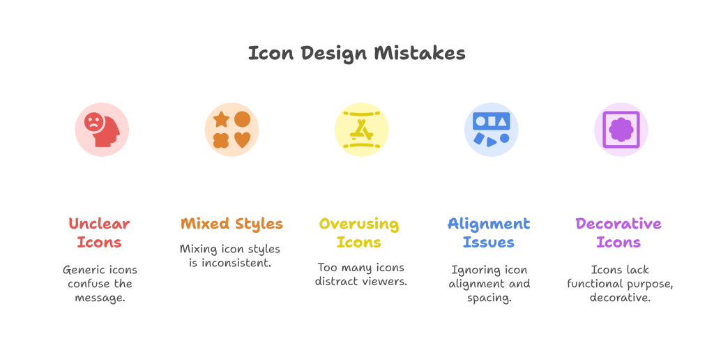
Common Mistakes to Avoid
Using generic or unclear icons that confuse the message.
Mixing multiple icon styles within the same presentation.
Overusing icons to the point of distraction.
Ignoring alignment and spacing around icons.
Using icons as mere decoration without functional purpose.
Final Tips
When chosen and placed thoughtfully, icons become powerful communication aids that simplify content and boost engagement. At A1 Slides, we emphasize purposeful icon use to help your presentations tell clear, compelling stories that resonate.