Typography in Presentation Design: Enhancing Clarity and Engagement
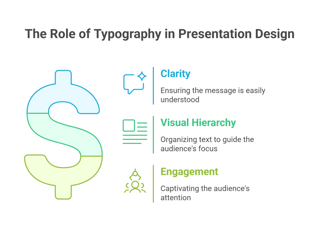
In the realm of presentation design, typography is more than just choosing attractive fonts. It’s about using text to communicate your message clearly, establish a visual hierarchy, and engage your audience effectively. Whether you’re crafting a PowerPoint presentation or a Google Slides deck, understanding the principles of typography can elevate your slides from mundane to memorable.
What Is Typography in Presentation Design?
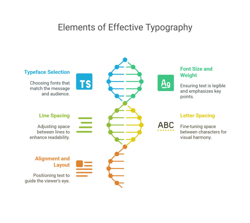
Typography refers to the style, arrangement, and appearance of text. In presentations, it encompasses:
Typeface Selection: Choosing appropriate fonts that align with your message and audience.
Font Size and Weight: Ensuring text is legible and emphasizes key points.
Line Spacing (Leading): Adjusting space between lines to enhance readability.
Letter Spacing (Kerning): Fine-tuning space between characters for visual harmony.
Alignment and Layout: Positioning text to guide the viewer’s eye and create a balanced design.
Effective typography in presentations ensures that your content is not only readable but also visually appealing, guiding your audience through your message seamlessly.
Best Practices for Typography in Presentation Design
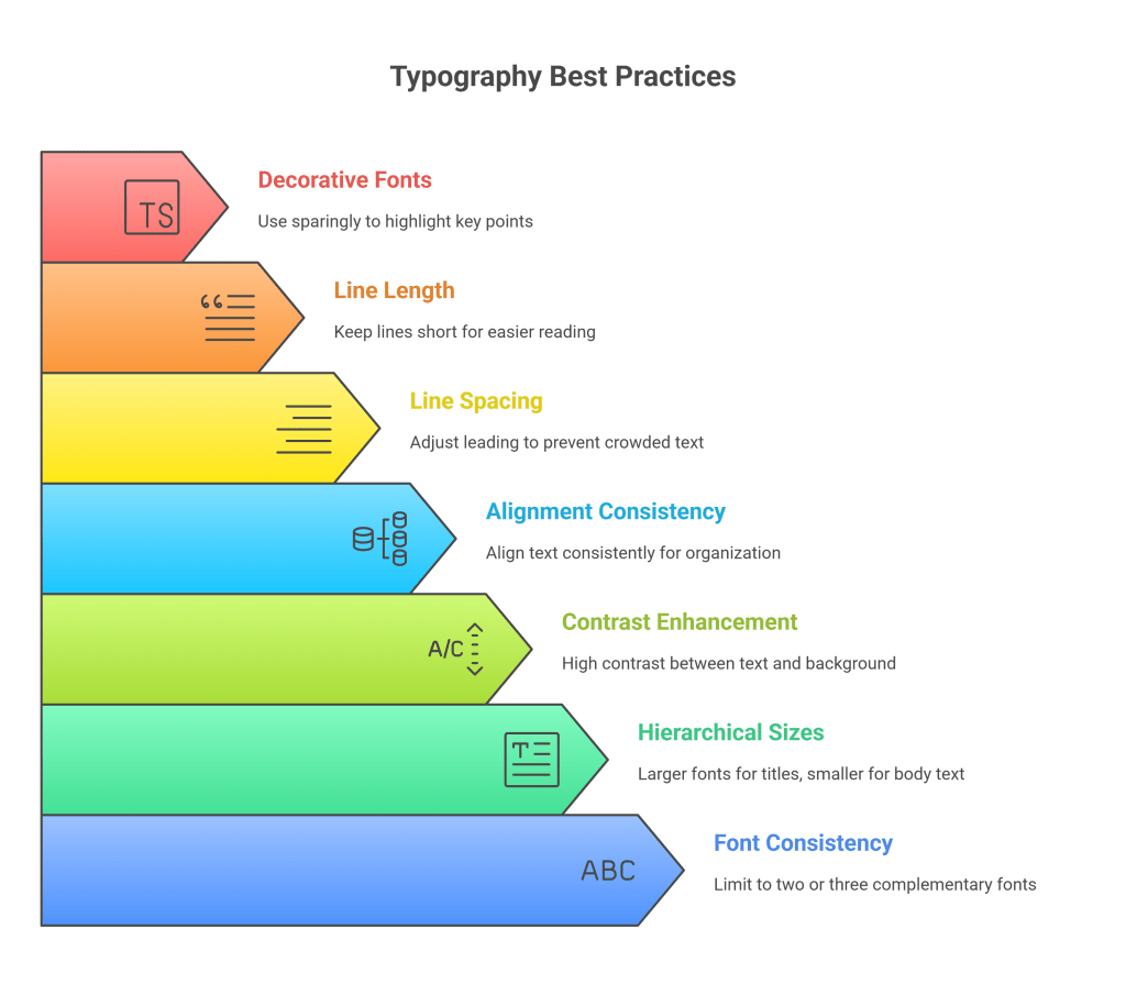
Limit Font Choices: Stick to two or three complementary fonts to maintain consistency and avoid visual clutter.
Use Hierarchical Font Sizes: Larger fonts for titles and headings, smaller for body text, to establish a clear reading order.
Ensure Sufficient Contrast: Use high contrast between text and background to enhance readability, especially for audiences viewing from a distance.
Maintain Consistent Alignment: Align text consistently (e.g., left-aligned) to create a clean and organized appearance.
Apply Appropriate Line Spacing: Adjust leading to prevent text from appearing crowded, improving legibility.
Be Mindful of Line Length: Keep lines of text short to facilitate easier reading and comprehension.
Avoid Overuse of Decorative Fonts: Use decorative fonts sparingly to highlight key points without overwhelming the audience.
Common Typography Mistakes to Avoid
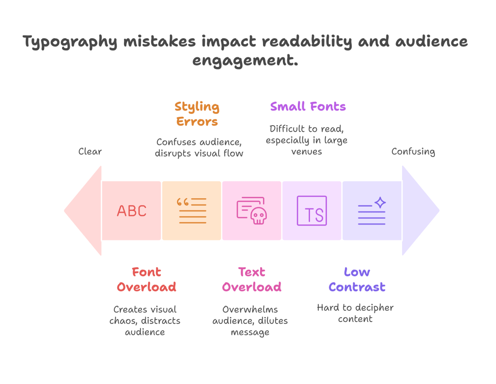
Using Too Many Fonts: Overloading your slides with multiple fonts can create visual chaos and distract from your message.
Small Font Sizes: Text that’s too small can be difficult to read, especially in large venues.
Poor Contrast: Low contrast between text and background can make content hard to decipher.
Inconsistent Styling: Inconsistent use of bold, italics, and underline can confuse the audience and disrupt the visual flow.
Overcrowding Slides: Including too much text on a single slide can overwhelm your audience and dilute your message.
Final Thoughts
Mastering typography in presentation design is essential for creating slides that are not only visually appealing but also effective in communicating your message. By adhering to best practices and avoiding common mistakes, you can design presentations that captivate your audience and leave a lasting impression.