Visual Hierarchy in Presentation Design:
Guide Audience Attention Effectively

Visual Hierarchy in Presentation Design: Guide Audience Attention Effectively
In the realm of presentation design, visual hierarchy is the unsung hero that directs your audience’s gaze, emphasizes key points, and ensures your message is communicated effectively. By strategically arranging elements, you can lead viewers through your content seamlessly, enhancing comprehension and engagement.

What is Visual Hierarchy?
Visual hierarchy refers to the arrangement and presentation of elements in a way that signifies importance. It leverages design principles to guide the viewer’s eye to where you want them to focus first, second, and so on. In presentations, this means structuring your slides so that the most critical information stands out, facilitating better understanding and retention.

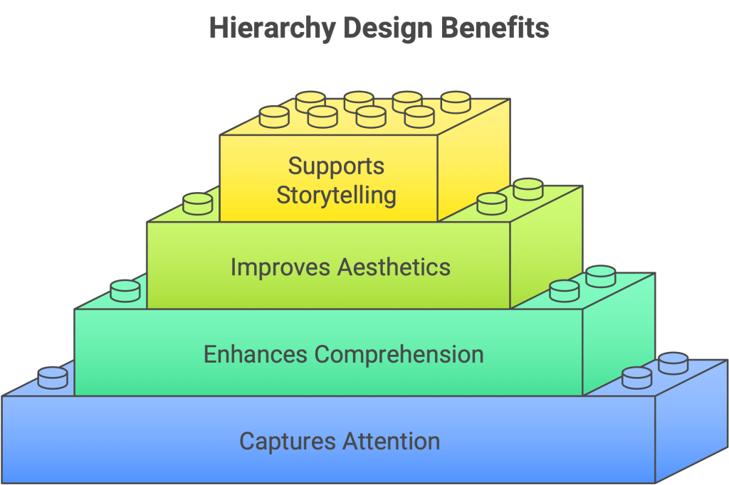
Why is Visual Hierarchy Important in Presentations?
Captures Attention: A well-designed hierarchy draws viewers in and keeps them engaged.
Enhances Comprehension: Organizing content logically helps the audience process information more efficiently.
Improves Aesthetics: A clear hierarchy contributes to a clean, professional look.
Supports Storytelling: Guides the audience through your narrative in a structured manner.
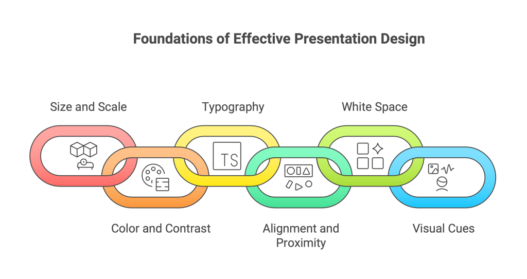
Key Principles of Visual Hierarchy in Presentation Design
1. Size and Scale
Why it matters: Larger elements naturally draw more attention. Adjusting the size of text and visuals can indicate their relative importance.
Tips:
- Use larger fonts for headings and smaller ones for body text.
- Scale images to emphasize key visuals.
2. Color and Contrast
Why it matters: Color can highlight or downplay elements. High contrast between text and background enhances readability.
Tips:
- Use bold colors for primary information.
- Ensure sufficient contrast between text and background.
3. Typography
Why it matters: Font choices and styles can convey hierarchy and tone.
Tips:
- Limit the number of fonts to maintain consistency.
- Use bold or italic styles to emphasize points.
4. Alignment and Proximity
Why it matters: Proper alignment creates order, while proximity indicates relationships between elements.
Tips:
- Align text and images to a grid.
- Group related items together to show connection.
5. White Space
Why it matters: Also known as negative space, white space prevents clutter and allows elements to breathe.
Tips:
- Avoid overcrowding slides.
- Use margins and spacing to separate sections.
6. Visual Cues
Why it matters: Arrows, lines, and icons can direct attention and indicate flow.
Tips:
- Use arrows to guide the eye through a process.
- Incorporate icons to represent ideas visually.
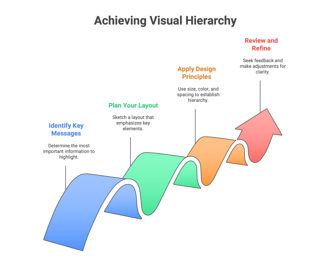
Implementing Visual Hierarchy: A Step-by-Step Guide
- Identify Key Messages: Determine what information is most important.
- Plan Your Layout: Sketch a rough layout emphasizing key elements.
- Apply Design Principles: Use size, color, and spacing to establish hierarchy.
- Review and Refine: Seek feedback and make adjustments to enhance clarity.
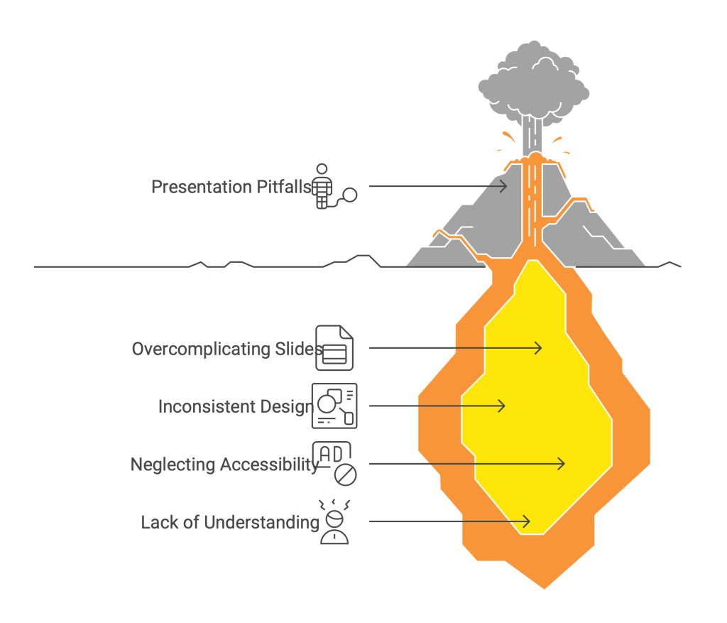
Common Mistakes to Avoid
- Overcomplicating Slides: Too many elements can overwhelm the audience.
- Inconsistent Design: Varying styles can confuse viewers.
- Neglecting Accessibility: Ensure your design is readable for all, including those with visual impairments.
Final Thoughts
Mastering visual hierarchy in presentation design is essential for effective communication. By thoughtfully arranging elements, you can guide your audience through your content, highlight key messages, and deliver a compelling presentation. Remember, simplicity and clarity are your allies in creating impactful slides.