Quick Design Fixes to Improve
Your Presentation Immediately

Let’s be honest. You’ve sat through that presentation, haven’t you? The one with tiny text you can’t read, slides crammed with paragraphs, bizarre animations, and a color scheme that makes your eyes water. You know the feeling – you disconnect, check your phone, and just wait for it to be over. It’s often referred to as “death by PowerPoint,” and it’s the silent killer of many good ideas.
As a presenter, the last thing you want is to be that presenter. You’ve got valuable information to share, ideas to land, and an audience you need to connect with. But maybe presentation design isn’t your superpower, or perhaps you’re short on time. The good news? You don’t need a design degree or hours of free time to make an immediate impact on your PowerPoint presentation design.
Sometimes, a few quick, smart presentation design fixes are all it takes to elevate your presentation from ‘meh’ to memorable. Ready to rescue your next talk from the dreaded “death by PowerPoint” and learn how to improve presentation slides quickly? Let’s dive into simple, actionable steps you can take right now.
Declutter Your Slides: Less is DEFINITELY More for Better Presentation Design
This is perhaps the most impactful quick design fix you can make, and often the easiest. By simplifying your content, you make it easier for your audience to follow along and absorb your key points.
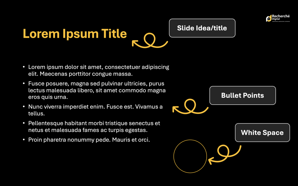
- One Idea Per Slide: Look at each slide. Can you summarize its core message in one sentence? If not, break it down! Trying to cram too many points onto a single slide is a guaranteed way to overwhelm your audience and dilute your message. This is a fundamental rule for effective presentation design.
- Bullet Points, Not Paragraphs: Your slides are visual aids for you and memory joggers for the audience, not speaker notes or a report. Condense information into concise bullet points or short phrases. If you have lengthy explanations, those are for you to say, not for the audience to read off the screen. (Think of the classic “6×6 rule” – no more than 6 bullet points, no more than 6 words per point. It’s a good starting point for presentation design improvement, though not a strict law).
- Embrace White Space: Don’t feel the need to fill every inch of your slide. Empty space (often called “white space” or “negative space”) is your friend! It helps the important elements stand out, makes your slide look cleaner, and gives your audience’s eyes a place to rest. It’s a powerful tool in presentation slide design.
Make It Readable: Font & Color Essentials for Clear Slides
If your audience can’t easily read your slides, nothing else matters. Prioritizing readability is a non-negotiable presentation design tip.
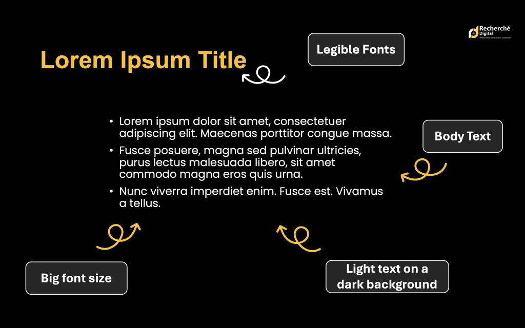
- Choose Legible Fonts: Stick to clean, professional fonts that are easy to read from a distance. Sans-serif fonts (like Arial, Calibri, or Lato) are generally excellent choices for presentations because of their clarity. Avoid overly decorative or script fonts that require effort to decipher. Choosing the right presentation font is key.
- Less is More with Fonts: Using too many different fonts looks messy and unprofessional. Choose just one or two complementary fonts – maybe one for headings and another for body text – and stick to them throughout for consistency in your presentation style.
- Contrast is Key: Ensure a strong contrast between your text color and your background color. Dark text on a light background or light text on a dark background works best. Avoid low-contrast combinations (like light grey text on a white background) that strain the eyes. This is critical for accessible presentation design.
- Go Big with Font Size: Don’t make your audience squint! Your body text should be easily readable from the back of the room – think a minimum of 24pt, preferably larger. Headings should be significantly larger to create visual hierarchy. This is a simple yet effective presentation design tip.
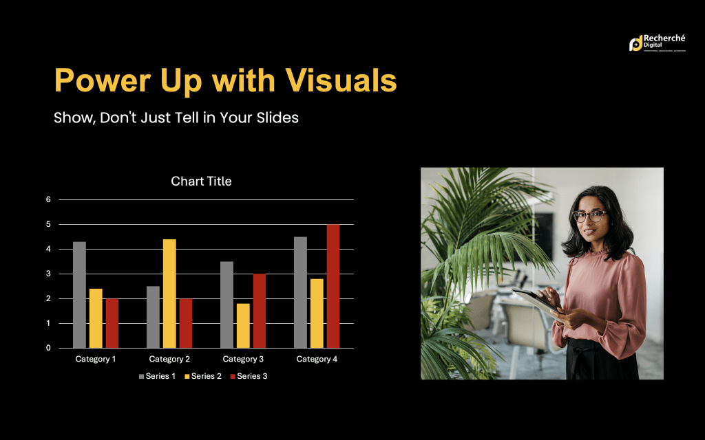
Power Up with Visuals: Show, Don't Just Tell in Your Slides
Humans are visual creatures. Leverage this in your presentation slide design! Visuals can make complex information digestible and your presentation much more engaging.
- Replace Text with Graphics: Can a chart or graph explain your data faster than a table? Can a relevant, high-quality image or icon represent a concept better than a block of text? Look for opportunities to convert information into visuals. Using presentation graphics wisely enhances understanding.
- Use High-Quality Assets: Blurry, pixelated, or generic stock photos scream “unprofessional.” Use high-resolution images, crisp icons, and clean, easy-to-understand charts that directly support your message. Visuals should add value, not just decoration. Sources for good visuals include reputable stock photo sites (like Pexels or Unsplash for free options) or creating your own simple graphics.
Establish Consistency: Build a Polished Look Instantly
Consistency builds trust and makes your PowerPoint presentation design look polished and professional. It signals attention to detail and strengthens your brand or message.
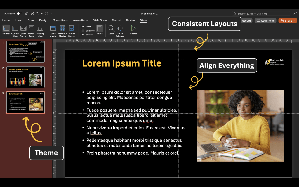
- Stick to a Theme: Decide on a presentation design theme and stick to it. This includes your color palette (select 2-4 primary colors and use them consistently – perhaps incorporating brand colors), your fonts (as mentioned above), and the overall layout style of your slides.
- Consistent Layouts: Use similar layouts for similar types of content. For example, all your section title slides should look alike, and all your data slides should follow a consistent structure. Utilizing your presentation software’s built-in templates or Slide Master feature is incredibly helpful for maintaining this consistency effortlessly. This saves time and improves your presentation style.
- Align Everything: This is a small detail that makes a huge difference in presentation professionalism! Take a moment to properly align text boxes, images, shapes, and other objects on each slide. Misaligned elements look sloppy and can be distracting. Use the alignment tools in your software – they are there to help!
Animation & Transitions: Use Sparingly (and Wisely!)
Avoid turning your presentation slides into a circus act. While dynamic elements have their place, overuse detracts from your message.
- Subtlety Wins: Flashy entrances, bouncing text, and whooshing transitions are usually more distracting than helpful. Stick to simple, subtle transitions (like fades or simple pushes) between slides for a smooth flow.
- Purposeful Animation: Use animations only when they serve a clear purpose. This might be revealing bullet points one by one to keep the audience focused, or highlighting a key part of a diagram. If an animation doesn’t enhance understanding or engagement, leave it out. This applies whether you’re working on a PowerPoint or Google Slides design.
You've Got This! Quick Fixes for Big Impact
Implementing these quick presentation design fixes won’t just make your slides look better; they will make your message clearer, your audience more engaged, and you, as the presenter, feel more confident. You don’t need a complete overhaul – just a few strategic adjustments can make an immediate, positive impact on your presentation quality.
Our team at A1 Slides understands the power of compelling presentations. With 15 years of experience, we specialize in creating impactful PowerPoint Presentations, Pitch Decks, and more for clients across 50+ industries globally.
So, before your next presentation, take 15-30 minutes and apply a couple of these simple presentation design tips. Your audience (and your message) will thank you!