10 Pro Tips for PowerPoint Slides That Genuinely Impress
Important Takeaways:
By [Author Name / Your Team Name]
Ever felt that sinking feeling as you click through your presentation, sensing your audience’s attention drifting away? You know the information is solid, but the slides… well, they just aren’t landing. Maybe they’re a bit text-heavy, visually inconsistent, or just plain… uninspired. Designing effective slides is a crucial part of delivering a memorable presentation.
You’re not alone! Many people struggle to move beyond basic templates and create PowerPoint slides that truly support their message and captivate their audience.
Good news: you don’t need to be a professional graphic designer to make a huge difference. By focusing on clarity, consistency, and smart visual choices – key PowerPoint best practices – you can elevate your presentations from forgettable to fantastic.
Ready to ditch dull slides? Here are 10 pro tips (plus a bonus!) grounded in expert advice, to help you design PowerPoint slides that actually impress:
Tip 1: Plan Your Narrative & Use a Consistent Template
Use a Template or Slide Master:
Don’t design each slide from scratch. Set up your core fonts, colour palette, and logo placement in the Slide Master (learn more on Microsoft’s official guide) or start with a well-designed template. This saves time and ensures brand consistency.
Go Widescreen (16:9)
Most modern screens are widescreen. Using a 16:9 aspect ratio generally gives you more flexible space for creative PowerPoint layout ideas compared to the older 4:3 format.
Why this matters:
Consistency builds trust and professionalism. A solid plan prevents rambling slides and focuses your message.
Tip 2: Define Your Visual Style (Fonts & Colors)
Imagine reading a book where the font changes every page – confusing, right? Your slides need a unified style.
Limit Your Color Palette:
Choose 2-3 primary colours (maybe your brand colours?) and perhaps 1-2 accent colours for your PowerPoint color palettes. Stick to these throughout for visual harmony.
PowerPoint Color Palette
Choose Fonts Wisely (and Sparingly):
When choosing PowerPoint fonts, select 2 (max 3) readable options. Often, a clean sans-serif font (like Arial, Calibri, Open Sans) works great for body text, maybe paired with a complementary font for headings. Readability is paramount. Avoid overly decorative or script fonts for main content.
Why this matters:
A consistent visual style makes your presentation look polished, professional, and easier for the audience to follow.
Tip 3: One Slide, One Core Idea (Avoid Overload)
This is crucial. Resist the urge to cram multiple points onto a single slide. Focus each slide on conveying one central message or piece of information.
Why this matters:
It forces clarity and reduces cognitive load for your audience, helping them easily digest each point before moving on. Less clutter = more impact.
Tip 4: Slash Text to Boost Engagement (Less is More)
Let’s be honest: no one wants to read paragraphs on a screen while trying to listen to you. Your slides are visual aids, not your script! Follow these slide design best practices:
Keywords & Short Phrases Only:
Think headlines, key stats, brief labels.
Rough Guideline:
Aim for fewer than 6-8 lines of text, maybe around 30 words max per slide. This helps avoid text-heavy slides. If you need more detail, put it in your speaker notes or a separate handout.
Why this matters:
It keeps the audience focused on you and your spoken message, using the slide purely for visual reinforcement.
Tip 5: Use High-Quality Visuals (Images & Icons, Not Clipart!)
Humans are visual creatures! Replace text with compelling, engaging PowerPoint visuals whenever you can.
Relevant & High-Resolution:
Use photos, icons, and simple charts that directly support your point. Ensure images are crisp and clear, not pixelated.
Ditch the Clipart:
Avoid generic, dated clipart. Look for modern icons or quality stock photos.
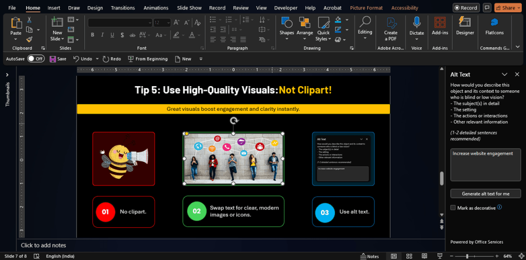
📸 Say Goodbye to Clipart
Avoid generic, dated clipart. Choose sleek icons and high-res visuals that reflect modern design standards.
Accessibility Bonus:
remember to add alt text to your images. This describes the image for screen readers and visually impaired users, and it’s also good for SEO!
Example: Instead of bullet points listing steps, could you use a simple graphic with numbered icons?
Why this matters:
Visuals make your presentation more engaging, memorable, and can often communicate complex ideas faster than text.
Tip 6: Prioritize Readability (Contrast & Font Size)
If your audience has to squint to read your slides, you’ve already lost them.
Contrast is Key:
Ensure there’s strong contrast between your text/graphics and the background (e.g., dark text on a light background, or vice-versa).
Accessibility Check:
Use online color contrast checker tools to ensure your choices meet accessibility standards (WCAG AA is a good benchmark).
Go Big with Fonts:
Think about the person in the back row. Font sizes of 24pt or even larger are often recommended for body text on slides. Headings should be even larger.
Why this matters:
Clear readability ensures your message gets across effortlessly without causing eye strain or frustration for anyone in your audience.
Tip 7: Simplify Data Visualization for Clarity
Presenting data? Avoid overwhelming charts or dense tables.
Simplify Charts:
Use basic chart types (bar, line, pie) and ensure they are clearly labelled. Remove any unnecessary clutter (“chart junk”) like excessive gridlines or 3D effects.
Highlight the Key Insight:
What is the one thing you want the audience to take away from the data? Make that obvious. (Consider linking to your internal post on data visualization: Data Viz).
Why this matters:
Clear data visualization helps your audience grasp complex information quickly and supports your narrative effectively.
Tip 7: Simplify Data Visualization 📉➡️📈
Don't overwhelm with complex charts — keep it clean, clear, and focused on one takeaway.
Bar, Line, or Pie – easy to read, no chart junk
Make the takeaway super clear — not the full dataset
No 3D, no clutter — clean lines and labels only
Tip 8: Leverage White Space for a Clean Layout
Don’t be afraid of empty space! White space (or negative space) is an active design element. Jam-packing your slide makes it feel cluttered and stressful. Explore different PowerPoint layout ideas that incorporate ample breathing room.
Why this matters:
Strategic use of white space makes your slides feel cleaner, more professional, and helps draw attention to the most important elements.
Tip 8: Leverage White Space 🤍
Don’t fear empty space — use it strategically. White space gives your content room to breathe and your audience room to focus.
Tip 9: Align Elements for a Polished, Professional Look
Little details make a big difference. Randomly placed text boxes or slightly crooked images look sloppy.
Use Alignment Tools:
PowerPoint has built-in tools to perfectly align objects (text boxes, images, shapes) to each other or to the slide edges. Use them for a crisp finish!
Why this matters:
Proper alignment creates a sense of order and professionalism, making your slides look intentionally designed, not thrown together.
Tip 9: Align Elements for a Polished Look 🧲
Randomly placed elements can ruin a clean design. Use alignment tools to make your layout feel balanced and professional.
Align to slide or to each other
Spacing and symmetry matter
Tip 10: Use Animations & Transitions Purposefully
Animations and transitions can add a touch of flair, but they can easily become distracting or cheesy.
Subtlety is Key:
If you use them, opt for simple, clean effects (like a gentle fade or wipe).
Consistency Rules:
Use the same transition between all slides for a cohesive feel.
Purposeful Animation:
Only animate elements if it helps clarify a point or control the flow of information. Ask yourself: Does this add value or just distract from the core message?
Why this matters:
Overuse of flashy effects screams amateur. Subtle, purposeful animation enhances flow; excessive animation detracts from your message and professionalism.
Tip 10: Use Animations & Transitions Purposefully 🎞️
Subtle motion = smooth experience. Overdoing it = amateur hour. Use transitions to guide, not to distract.
Use fades/wipes — skip bouncing text & flying titles
Same transition across slides = flow & professionalism
Reveal step-by-step or emphasize — not just for flair
Bonus Tip #11: Practice Your Delivery with the Slides
Amazing slides can fall flat with poor delivery. Run through your presentation with your slides. Check your timing, ensure the visuals smoothly support your talking points, and get comfortable with the flow. Great design and confident delivery are a powerful combination.
🎤 Bonus Tip 11: Practice Your Delivery
Slides set the stage — you deliver the impact. Run through your talk with the visuals. Get the rhythm, the transitions, the timing just right.
so visuals match your voice.
for a smooth delivery.
let slides guide your story, not dictate it.
Quick Resources for Your Next Presentation:
- Templates: Checkout Free Templates Here
- Color Contrast Checkers: WebAIM Contrast Checker, Adobe Color Contrast Analyzer
From Dull Slides to Impressive Delivery
Creating truly impressive PowerPoint presentations isn’t just about mastering software features. It’s about thoughtful design choices focused on clarity, consistency, visual appeal, and respect for your audience’s attention, combined with confident delivery.
Implement these tips, and you’ll be well on your way to designing slides that not only look great but actively help you connect with your audience and deliver your message with impact. Give them a try!
Looking for help in presentation designing?
Checkout out our PPT design services
With 1000+ presentations in 50+ industries, in 10+ countries, A1 Slides has helped corporates, Govts & Enterprises communicating better with impressive slides.