
Designing a Finance PPT Requires These 9 Techniques
Introduction
Finance Presentations can present a thriving business in a fascinating arrangement of numbers. They can be a good tool to share the success of a big marketing campaign. Past performance, projected performance, industry-averages or competitor-data, there may be numerous ingredients to make a Finance Presentation.
But making a Finance Presentation comprises a careful arrangement of bits and pieces on the base of creativity. Different facts and texts are supported by precise data and images to make them etched in audiences’ minds. A large set of facts can be portrayed in one related graphical presentation or chart. Lots of ingredients combine into a unified, separate creation. It’s a specialized job and must be outsourced to an adept agency if you do not have a professional in house to do that.
The fact remains that you may be running a good and profitable business, your team may pitch in with some titbits of presentation but making a professionally designed Finance Presentation is altogether a different exercise. In this submission, I suggest to you 9 vital reasons why your next Finance Presentation must be professionally designed. A professionally designed Finance Presentation would make your business-plans or numbers trustworthy and help you achieve the goal you expect from it in a methodical way.
9 reasons to have a professionally designed Finance Presentation
If you don’t have a good stretch of time to read them all, you can directly go to a specific point below in the list and click it to read it comprehensively:
- 4 critical requirements why you need professional designers for a Finance Presentation
- 3 basic criteria your Financial Presentation must justify
- Meaningful Graphical depiction of data, a must for a Financial Presentation
- Simplified data and numbers make sense in a Financial Presentation
- Stuffing your Finance Presentation with figures & numbers doesn’t work
- A storyline works wonders for a Financial Presentation
- Overfilling the slides with too many words is a Big No in a Finance Presentation
- Some suitable fonts for a Financial Presentation
- Colour-combination in a Finance Presentation
1. Making a Presentation about Finance is an art:
Outsourcing your presentation to an agency ensures a presentation which would be tailor-made for your business or other fiscal purposes. The agency-people work regularly with and for a range of diverse businesses and in doing so, they develop a knack to present a specific business-plan in a specific style and manner. They know how and when to use graphs and charts. They know the exact utility of different charts and graphs. Their value-added additions and suggestions work wonders for the presentation.
Handling finance is one thing but presenting it before target-audiences is a completely different matter.

2. You get time to handle your core work:
An adept agency takes the entire onus of making the Finance Presentation on your behalf based on your inputs. You can use this time to utilize it in other regulatory components of your business or work. Also, you save yourself from arranging different craft-related hassles to shape them into a professional PPT presentation.
3. Specific job:
When you hire an agency, you know for the fact that this is its area and work-field. The agency-people form a collective acumen with deep insights and understanding in their respective skills. They know that what do you want your data to tell people. And when they get to know what you want your data to convey, they start visualizing it in a proper manner. Facts and numbers, visuals, textual content and other features get accumulated by a set of professionals who in effect elevate the final output to another level.
4. You get a set of skilled people:
Researches have indicated that nearly 60% of sales-leaders believe that the quality of their Sales Presentations needs improvement. When the team-members at the agency get to understand your business, finance and its details, they develop a vision which is their own. This vision is amalgamated with different sets of perspectives in the final presentation to give it a professional and target-audience-centric feel. Every team-member works in tandem with each other to create a combined entity, which is a true and effective Finance Presentation.
After all, the core purpose of a Monetary Presentation is to pass on the relevant information and data to your target-audiences. If it is properly designed, it generates interest and the information is gulped by the audiences seamlessly. That’s why, 3 basic criteria or standards can be outlined:
1. One capsule of requisite information and data:
Your Finance Presentation must be a compact capsule of your financial detailing. The details must be terse and compact, consuming less time of the audiences. Enlightening data and coherent information about your business must be interwoven with the help of attention-grabbing texts, graphs, charts and images to make it a complete package of financial details.

2. Gut-stirring:
Like other presentations, your Financial presentation must whip up interest in target-audiences and retain it till the last. A mix of facts, figures and images from your side in the shape of a story must capture their attention with a deeper impact. Important messages of the offering must be presented only to fit in their small attention-spans.

When something interests you, it extracts your involvement.
3. Engagement-tool
Target-audiences’ involvement in the details of your Financial Presentation must trigger a Call of Action from them for sure. You can expect a flurry in sales-activities from your sales executives, you can expect a deepened trust from your team-members in your financial journey or you can hope for a fruitful response from your investors. A professionally designed Financial Presentation carries a huge engagement-quotient in it.
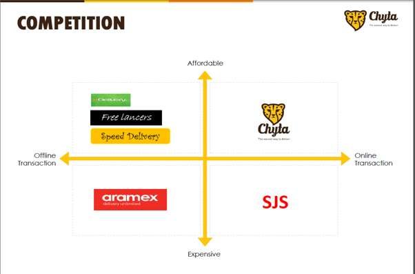
While the graphical depiction of data simplifies facts and figures, the real reason to use them should be the base-point of their type-selection. A definite rationale must lead you to a specific graph for your presentation. In other words, a chart or graph must be inserted to support the main message of your presentation.
Area-based graph depicts the correlation of different ingredients against a big entity over the time like a company’s over-all profit versus revenues of your start-up, coming through your products or services over a fixed period.
While the column-based graph explains the variations in individual value up and down, the Bar-based graph illustrates the variations in these values horizontally.
While a Pie-chart or graph carries proportion-wise distribution of something, a Line- graph comprehensibly presents data of something at different stages in time.
A Pie-graph doesn’t show the exact value of the data and so, you must be very careful to pick this visual tool for your presentation, keeping in mind the investors’ inherent urge to know the exact amount of anything.
A Finance PPT enriched with proper graphics is not a cup of tea for everyone. This is a completely specialized task. If you don’t have skilled designers at your place, don’t make a mess of it! There are several professional PPT making agencies in the market to work for you, outsource it to them!
Use of data in PPTs has come of age. Newer trends and features have been adopted. Data-arrangement and data-analysis have taken many leaps and you can very well empower your Finance PPT with these well-sorted data. Excellent PPTs always bear a definite flow in their data-depiction.
You can use various infographic tools, animations, charts and diagrams to inject rhythm and clarity in your Finance Presentation.
Revenue-projections, client-outreach, profits, exit-model; everything can be shown in an elucidatory way. But for all of this, your data must be filtered, arranged and simplified.
Convoluted facts and figures can confuse your audiences.
Data and statistics well-woven with the facts capture the imagination of audiences seamlessly.
Your numbers must not seem disintegrated from the rest of your Finance PPT.
People across the business-spectrum are always on the hunt to showcase their business-numbers. They try to insert every bit of information related to their businesses. Summary of various reports and analyses gets mention in presentations. But overdoing it with copious data and information can defeat the purpose. A small reference of everything triggering audiences’ curiosity is the basic trick. Especially in this era of brief attention-span, you must be wary of not overloading your presentation with numbers and figures.
Numbers are important when it comes to competition. You want to show your lead in your segment in the market by comparing your products or services with that of others on the base of various numbers. You want to project every aspect of your revenue-generation and that creates a possibility that you may carry too far with inserting different statistics.
The other temptation you may carry to pack your presentation with different numbers is the myth that numbers get lodged in human memory faster than facts and for a longer period.
There must be a balance of all the ingredients in a presentation. Complicated statistics and big data become uninteresting. Their use must not be at the cost of a diminished engagement-quotient. Data and numbers remain dynamic and mnemonic in a Finance Presentation when used intelligently in a combination of its other facets.
Of course, your Finance Presentation will lose its sheen when you make a blitz of Excel sheets and Bullet Points. Even while making a Finance Presentation, we should always remember that numerical information is complex and difficult to understand, but we humans can grasp visual information and de-construct the meaning from it quite easily.
A Finance Presentation talks of business and finance. But if intelligently crafted, facts, figures and data can be inserted in an engaging manner. Aptly presented in a wrap of story, different statistics and data send out convincing message for target-audience. If these statistics bring sometimes surprise and sometimes awe on audiences’ faces, then they can be termed engaging and they are more likely to make your overall presentation impactful. The greater the emotional connect, the better the involvement! And involvement makes your presentation successful.

Secondly, the element of the story saves the powerpoint presentation from being a dull and boring presentation of various facts and figures. But your storyline must merge with the facts and figures of your PPT effortlessly. A conspicuously different story would make matters worse. The story may not match at every stage, but a final coherence is must at the end to uplift the contents of the presentation. Every company has a beginning; it has different sets of people in management, different sets of products or services, different narratives of business-revenues or unique series of finance-related events. All these facts are unique for a company and can be woven in unique storylines.
As I said in my earlier blog, namely “How to write content for a PPT”, brevity is the soul of a PPT. And this is true for a Finance PPT as well. An effective Financial PPT with no more than 15-20 slides, must have minimal words on each slide. Overloading the slides with too many words or too much data can confuse the audience. Keeping in line with the conciseness, each slide of the PPT must carry the quantity of words which is enough to highlight the overall message of the slide.

While you must refrain from using heavy and difficult words, your textual content also must be generally free from ambiguous slangs. You must not cloud and complicate important information in wordy text-blocks which would often be missed by the audience. In fact, you must shape your big and complex ideas into short and clear sentences.
A good typeface creates an emotional response in relation to the message it is conveying — Jonathan Barnbrook
A Finance Presentation is a combination of so many aspects and features. They all become congruent to make it successful. The font for the texts in a Finance PPT or any presentation carries the entire mood and sense of the real core of the presentation. Words sculpted in a specific font must match the final message of your presentation. We can settle for a few fonts, but 6 of them can be considered suitable for different finance presentations:
- Calibri is a Sans-Serif font with an easy legibility of letters. Since it has been the default font in all the versions of MS-Office & Word for a longer period now, it is the most frequently used font for a Finance PPT as well. Thanks to its familiarity, people have started not to use in their PPTs to make their presentations a bit different.
- Cambria is a Serif font used for both, titles and normal textual material. A fun detail about Cambria – it has a square full stop and not a round full stop. With its slanting and upright serifs, Cambria is employed to infuse power and emphasis to the textual matter.
- Candara is a Sans-Serif font with a conspicuously rounded shape. The wavy figure of this font renders a completely different character to letters which you can choose for a specific feel of your presentation.
- Consolas, having the same horizontal space for every letter, comes into play when you show symbols, statistical or numerical facts in your Finance Presentation.
- Corbel is a unique Sans-Serif font which has numbers in it as lower-case numerals. You can use it for the texts in your presentation as per your liking and need.
- Constantia is a Serif font with numbers as lower-case numerals, like in Corbel font. With roughly triangular extensions to its letters, Constantia is a safe and good font to use to fit in the texts of your PPT.
Fonts are many and varied. And therefore, their selection for the texts in a presentation requires a good thought. The selected font must match the entire feel of your Finance Presentation. Textual content provides the flow to the presentation and simultaneously, the font provides the character and mood to the textual content. Its selection must be a well-thought decision.
When choosing colour-combinations, having conspicuous contrast of texts or graphics against the background or images works well.
The colour of the background and the colour of the texts, graphics or images must be in sharp contrast to each other to facilitate easy viewing.
A slide’s background with white or light-grey colour in mix with the opposite black text-colour is always advisable.
A black background and white font also make a good pairing.
A black background and yellow-coloured texts or graphics also make a good contrast with high legibility.
All-in-all, one of the biggest weaknesses of finance presentations in the industry is that they are purposely made to highlight data, not messages. Professional designers always keep the message in the core and then arrange other essentials to highlight that message.
Your audiences are not at all interested in the numbers, they just want to know what they mean.
Data and figures are alright till they help us draw meaningful conclusions from them. Don’t expect your audience will be able to infer the relevant meaning from the cloud of statistics and numbers!
To know more about finance PowerPoint designing packages and see samples click here