
In the infrastructure and energy sectors, capital projects live or die by the quality of information flowing from the site to the boardroom. Yet, a critical disconnect exists in how this information is presented.
When a Project Director presents a Monthly Project Review (MPR) or a Quarterly HSE update, they are rarely limited by a lack of data; rather, they are drowning in it. The average major capital project generates terabytes of performance data—from safety incidents and man-hours to supply chain logistics and cash flow variance & it’s a huge data to mine or make decisions from.
The major gap is when this data reaches the CFO or the Risk Committee, it frequently arrives in the form of a “Data Dump”—a dense, uncurated collection of spreadsheets and site photos pasted into PowerPoint.
This is not reporting; it is administrative abdication. And in an industry operating on single-digit margins and zero-tolerance safety standards, messy reporting is not just an aesthetic annoyance. It is a verifiable operational risk.
The "Data Dump" vs. The "Decision Tool"
The fundamental error most engineering-led organizations make is confusing “Availability of Data” with “Clarity of Insight” ( Both terms are seen interchangeable while they are way apart )
A 100-page deck containing every safety observation, every specific gravity reading, and every procurement line item does not inform the Board; it obscures the signal. We call this the “Volume-Value Paradox.” As the volume of reported data increases, the executive’s ability to identify critical risks proportionally decreases.
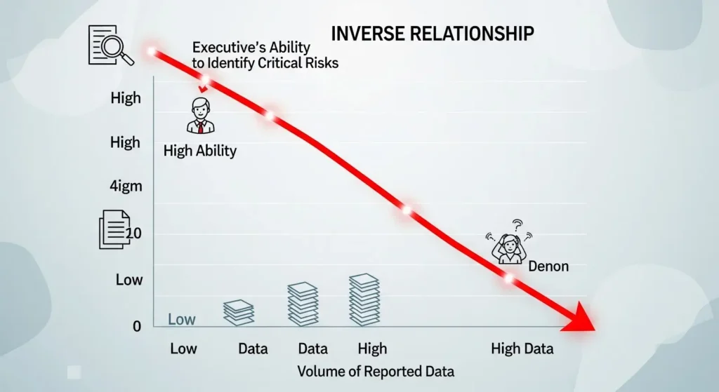
According to our Enterprise Presentation Outlook, executive review time has contracted by approximately 25-30% over the last five years. When a CFO has four hours to review a $500M portfolio, a report that requires “decoding” is a report that hides risk.
The "Lag Time" Risk: 30% Blindness
The most dangerous byproduct of messy reporting is Lag Time.
In traditional reporting cycles, site data is collected on Friday, collated by analysts on Monday, formatted into slides on Tuesday, reviewed by middle management on Wednesday, and presented to the Board on Thursday.
By the time the Board sees the “Red Flag” on a safety metric or a supply chain bottleneck, the reality on the ground has shifted by nearly a week. In dynamic construction environments or volatile energy markets, this creates a 30% Risk Blindness window. The Board is making decisions based on historical ghosts, not current realities.
Messy, unstandardized slides exacerbate this lag. When data is presented inconsistently—different formats for different sites, conflicting color codes for risk—executives spend their limited cognitive energy reconciling the format rather than interrogating the data.
Case Study: Reducing Incident Response Time for a National Utility
We recently partnered with a major utility provider managing a distributed portfolio of grid infrastructure projects. Their challenge was distinct: While their engineering controls were robust, their reporting was dangerously slow.
The Context:
The client’s weekly HSE and Operations deck was a 120-slide compilation of disparate Excel sheets from 15 different regional sites. It took the Project Management Office (PMO) three days just to assemble the file.
The “Before” State:
- Format: A “Frankendeck” of inconsistent charts, blurry site photos, and dense text tables.
- Cognitive Load: Executives had to hunt for the “Lead Indicators” (e.g., Near Misses) amidst the “Lag Indicators” (e.g., LTI free hours).
- Outcome: Critical safety trends were often spotted two weeks too late, resulting in reactive rather than proactive interventions.
The “After” State (Insight First Restructuring):
We did not just “clean up” the slides; we re-architected the information flow to prioritize Decision Velocity.
- Standardized “Risk Tiles”: We replaced the 15 disparate site reports with a unified “Risk Tile” system. Every site was visualized on a single “Heatmap” slide. Red tiles indicated sites requiring immediate Board attention; Green tiles were moved to the Appendix.
- The “Lead Indicator” Dashboard: We separated “Activity” (what happened) from “Insight” (what it means). The first slide focused exclusively on predictive metrics—trends in near-misses and non-compliance reports—forcing the Board to look forward, not backward.
- Visual Consistency: We implemented a locked “Traffic Light” protocol. Red meant the same thing across every site, eliminating the cognitive load of interpretation.
The Impact:
- Reporting Speed: The PMO reduced assembly time from 3 days to 4 hours due to standardized templates.
- Decision Velocity: The Board could identify high-risk sites in the first 5 minutes of the meeting.
- Operational Outcome: The client reported a measurable reduction in incident response time, as trends were flagged and addressed in the same week they occurred.
The Solution: Move from "Reporting Activity" to "Reporting Insights"
For Project Directors and CFOs looking to eliminate this hidden cost, the shift requires a change in philosophy. You must stop treating the Board deck as a “proof of work” and start treating it as a “tool for steering.”
If your current boardroom deck is hiding risks, click here to audit your reporting structure with our specialist team.
- Enforce the “10/30 Rule”
Structure your Monthly Project Reviews to contain 10 slides of logic (Insight, Variance, Request) and 30 slides of data (Appendix). Never force an executive to wade through the 30 to find the 10.
- Standardize the Visual Language
Do not allow different project managers to invent their own reporting formats. Implement a rigid, enterprise-wide design system for project tracking. Consistency creates speed. When the format is predictable, the brain skips the “decoding” phase and goes straight to analysis.
- Visualize the “So What?”
Every chart in your deck must have a headline that states the insight, not just the chart title.
- Bad Headline: “Q3 Steel Procurement Costs.”
- Good Headline: “Global Steel Volatility Will Impact Project Margin by 4% in Q4.”
Closing Thought
In the capital projects world, clarity is not a “soft skill.” It is a risk management control.
If your reporting is messy, you are not just presenting bad slides; you are introducing friction into a system that cannot afford it. The cost of a bad decision in the boardroom is far higher than the cost of fixing the presentation that led to it.