Unlock Professionalism: Mastering White Space in Your Presentations
Ever sat through a presentation where every slide felt crammed, busy, and just… overwhelming? You struggled to figure out where to look, what was important, and probably tuned out pretty quickly.
We’ve all been there. And often, the culprit is a lack of white space.
“White space,” also known as negative space, isn’t just empty background. It’s the unmarked area around and between the elements on your slide – your text, images, charts, and graphics. Think of it as the breathing room for your content. And while it might seem like “nothing,” it’s actually a powerful design tool that can elevate your slides from messy to masterful.
Using white space effectively is one of the simplest yet most impactful ways to make your presentations look professional, polished, and incredibly easy for your audience to understand.
Why White Space is Your Secret Weapon for Professional Slides
So, why dedicate precious slide real estate to… well, nothing? Because that “nothing” does a lot of heavy lifting for your presentation’s effectiveness:
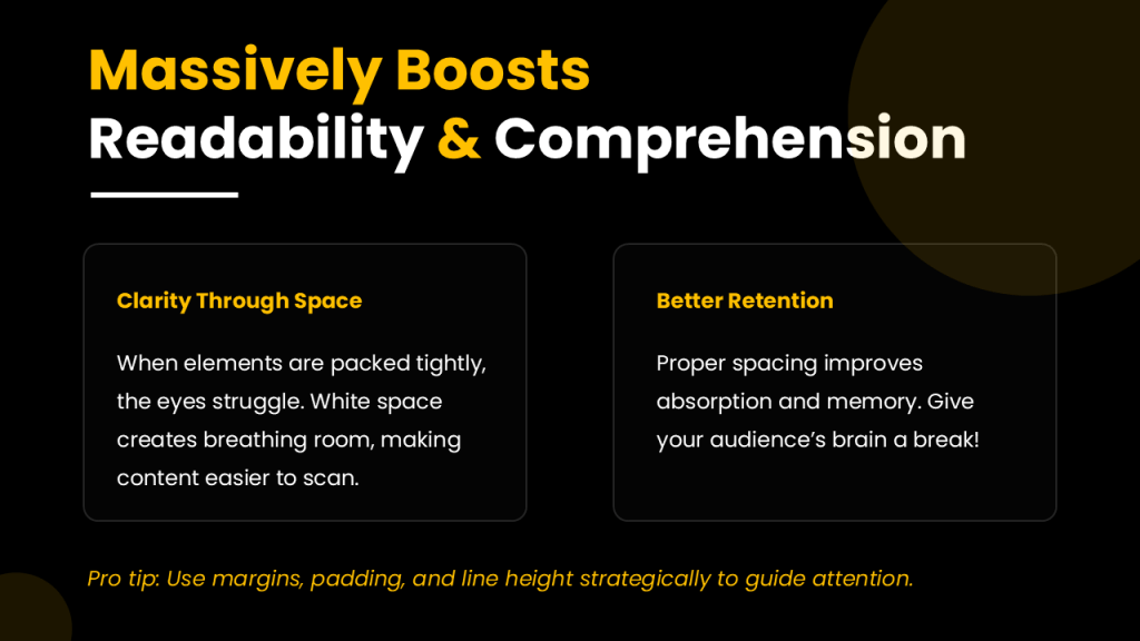
It Massively Boosts Readability and Comprehension:
When elements are packed tightly together, your audience’s eyes don’t know where to land. White space separates text and visuals, making your content easier to scan and read. This clarity can significantly improve how well your audience absorbs and remembers your message. Give their brains a break!
It Creates Focus and Guides the Eye:
Want your audience to pay attention to a specific point, image, or data nugget? Surround it with white space. This instantly draws the eye to that element, establishing a clear visual hierarchy and showing your audience what’s most important without you saying a word.
It Screams Professionalism and Elegance:
Think about high-end brands or modern website design. They often use generous amounts of white space. Why? Because it conveys sophistication, confidence, and a clean aesthetic. Cluttered slides look amateur; slides with smart white space look expertly crafted.
It Organizes and Simplifies Information:
Have several points or different types of content on a slide? Use white space to group related items together and separate distinct ones. This visual organization makes complex information feel less daunting and helps your audience process it step-by-step.
How to Unleash the Power of White Space in Your Presentations
Ready to transform your cluttered slides into clear, compelling visuals? Here are some practical techniques to master white space:
1. Embrace the "Less is More" Philosophy:
This is foundational. Stop trying to cram every single detail onto one slide. Focus on one core idea per slide. Use concise bullet points, short sentences, or impactful headlines instead of dense paragraphs. If you have too much content, split it into multiple slides. Your audience will thank you.
2. Generous Margins Are Your Friends:
Don’t let your content bleed to the edges of the slide. Set consistent margins around all four sides – give your content a frame. This instantly makes your slide look more intentional and organized. Aim for at least 0.5 inches, but don’t be afraid to go wider for a more modern feel.
3. Give Elements Room to Breathe:
Increase the space between different elements on your slide. This includes the space between text blocks, the gap between an image and accompanying text, and the distance between different points in a list. Group related items visually by placing them closer together than unrelated items.
4. Mind Your Line and Paragraph Spacing:
This is often overlooked white space! Adjust the spacing between lines of text (leading) and between paragraphs. Increasing these slightly improves readability and prevents your text from looking like an impenetrable block.
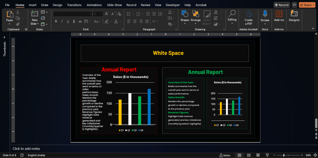
5. Use Visuals Strategically (with Space in Mind):
When incorporating images, charts, or graphs, ensure they have enough white space around them. Consider using images that have “empty” areas where you can overlay text without creating clutter. High-quality visuals surrounded by appropriate space are far more impactful than many cramped graphics.
6. Keep Backgrounds Clean:
While “white space” doesn’t have to be white, busy or heavily textured backgrounds can fight with your content and reduce the impact of your negative space. Simple, clean backgrounds (like white or a light color) allow your content and the white space to stand out effectively.
7. Highlight with Space:
Want a key statistic or quote to pop? Place it centrally on the slide and surround it with ample white space. This isolation makes it the immediate focal point.
8. Align and Organize with Grids:
Using alignment tools and considering a grid structure (even if invisible) for your layout helps ensure your white space is balanced and intentional. This prevents elements from looking randomly placed.
Common Questions About White Space
What exactly is white space in a presentation? Does it have to be white?
White space is simply the empty or unmarked area on your slide, regardless of its color. It’s the space between and around your design elements like text, images, and shapes.
Why is white space so important for professional-looking slides?
It improves readability, helps guide the audience’s focus to key information, creates a clean and elegant aesthetic, and helps organize complex content, all contributing to a more professional presentation.
How much white space should I leave on a slide? Is there a rule?
There’s no strict percentage, but a common guideline like the “2/3 rule” suggests aiming for about 2/3 of the slide to be white space, with 1/3 for content. More importantly, focus on whether the elements have enough room to breathe and if the key message stands out.
Can I use colored backgrounds instead of white and still have "white space"?
Absolutely! “White space” is a design term; the color of the background doesn’t matter. You can have “black space,” “blue space,” or any other color as your negative space. The key is that it’s empty area providing separation and structure.
How does white space help my audience understand the information better?
By reducing clutter and visually grouping related information, white space makes slides easier to scan and digest. It reduces cognitive overload, allowing your audience to focus on and process the key message more effectively.
Elevate Your Slides Today
Mastering white space is a fundamental step towards creating presentations that don’t just look good, but also communicate more effectively. It requires a shift in mindset from “filling the space” to “using space intentionally.”
Start by reviewing your existing slides. Can you reduce text? Increase margins? Add more space between points?
By applying these principles, you’ll create cleaner, more professional, and ultimately, more impactful presentations that truly resonate with your audience.
Want to dive deeper into presentation design? Check out these related posts:
With 1000+ presentations in 50+ industries, in 10+ countries, A1 Slides has helped corporates, Govts & Enterprises communicating better with impressive slides.