How to Design Presentations
for Mobile Viewing
How to Design Presentations for Mobile Viewing
With the rise of remote work and on-the-go learning, many people now view presentations on their mobile devices. Designing presentations that look great and communicate effectively on small screens is essential to reach your audience wherever they are.

Why Mobile-Friendly Presentation Design Matters
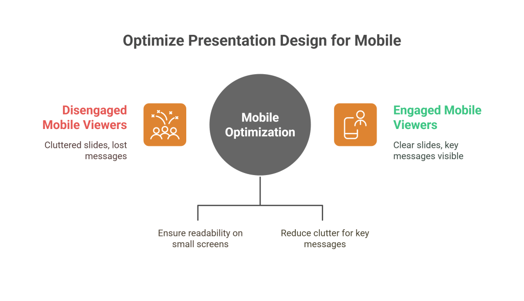
Mobile screens are smaller and more constrained than desktops or projectors. Without optimization, your slides can look cluttered, text may be too small to read, and key messages can get lost—leading to disengagement.

Best Practices for Mobile Presentation Design
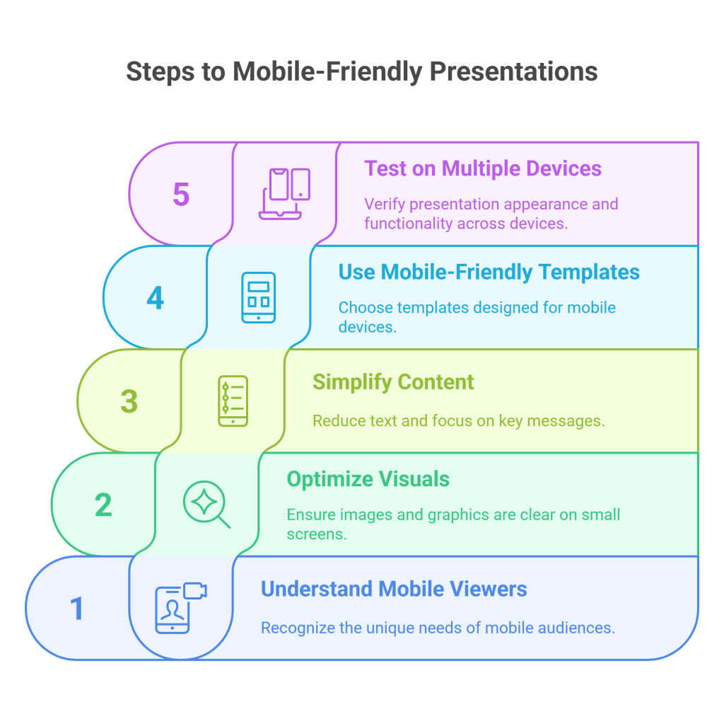
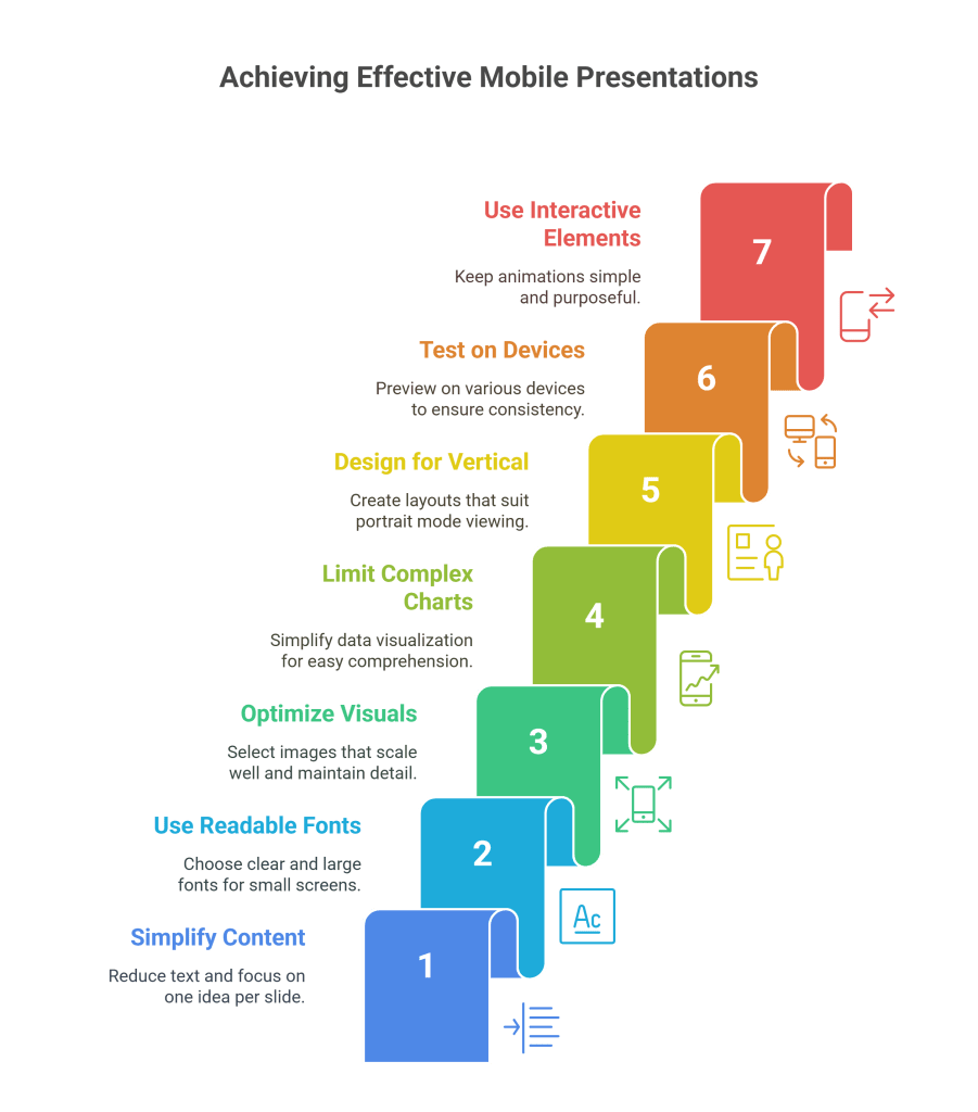
Simplify Slide Content
Use minimal text and focus on one idea per slide to avoid overwhelming viewers.Use Large, Readable Fonts
Choose font sizes and styles that remain clear on small screens.Optimize Visuals
Select images and graphics that scale well and don’t lose detail.Limit Complex Charts
Simplify data visualization to essential insights for easy mobile comprehension.Design for Vertical Viewing
Many mobile users view content in portrait mode—consider vertical-friendly layouts.Test on Multiple Devices
Preview your presentation on various phones and tablets to ensure consistency.Use Interactive Elements Sparingly
Mobile connections may limit smooth interactions—keep animations simple and purposeful.

Tools to Help Mobile Optimization
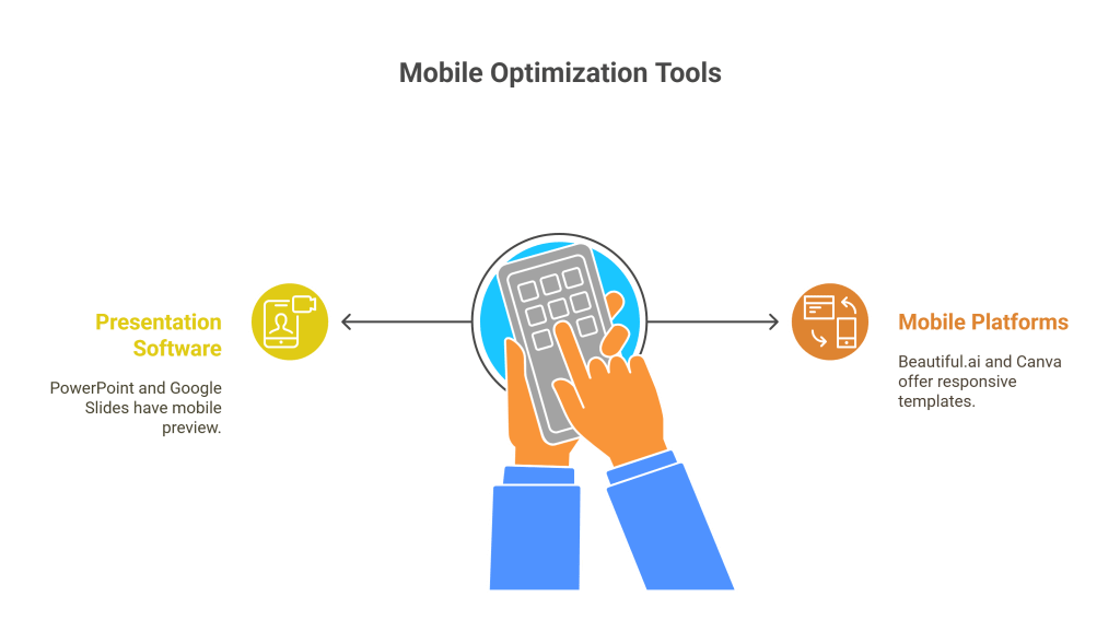
PowerPoint and Google Slides offer mobile preview modes.
Mobile-specific presentation platforms like Beautiful.ai or Canva provide responsive templates.

Final Thoughts
Designing presentations for mobile viewing isn’t just a trend — it’s a necessity. By focusing on clarity, simplicity, and testing on actual devices, you ensure your message shines no matter the screen size. A1 Slides is committed to helping you create mobile-friendly presentations that captivate and communicate effectively.


