Mastering Color Theory in Presentation Design:
Enhance Impact & Engagement

Mastering Color Theory in Presentation Design: Enhance Impact & Engagement
Color isn’t just a design element—it’s a powerful tool that can influence emotions, perceptions, and audience engagement. In presentation design, understanding and applying color theory can transform your slides from mundane to memorable. Whether you’re crafting a corporate pitch, educational lecture, or marketing presentation, the right color choices can enhance clarity, establish mood, and reinforce your message.
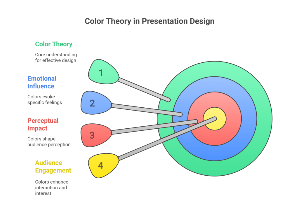
What Is Color Theory?
Color theory is a framework used to understand how colors interact, combine, and the psychological effects they elicit. It encompasses:
Primary Colors: Red, blue, and yellow—foundation hues.
Secondary Colors: Green, orange, and purple—created by mixing primary colors.
Tertiary Colors: Combinations of primary and secondary colors.
Color Harmonies: Strategies like complementary, analogous, and triadic schemes to create visually appealing combinations.
Understanding these principles helps in selecting colors that are not only aesthetically pleasing but also effective in communication.
Color Psychology: Evoking Emotions and Perceptions
Colors carry psychological meanings that can influence how your audience perceives your message. For instance:
Red: Conveys urgency, passion, or danger.
Blue: Evokes trust, calmness, and professionalism.
Yellow: Represents optimism, energy, and attention.
Green: Symbolizes growth, health, and tranquility.
Orange: Suggests enthusiasm, creativity, and warmth.
Purple: Implies luxury, wisdom, and creativity.
By aligning your color choices with the emotions you wish to evoke, you can enhance the effectiveness of your presentation.
Practical Tips for Applying Color Theory
Limit Your Palette: Use a primary color, a secondary color, and an accent color to maintain harmony and avoid overwhelming your audience.
Consider Color Contrast: Ensure sufficient contrast between text and background for readability. Light text on a dark background or vice versa works well.
Use Color to Establish Hierarchy: Differentiate headings, subheadings, and body text using color variations to guide the audience’s eye.
Align Colors with Brand Identity: If representing a brand, use its color palette to maintain consistency and reinforce brand recognition.
Be Mindful of Cultural Associations: Colors can have different meanings in different cultures. Ensure your color choices are appropriate for your audience.
Common Mistakes to Avoid
Overusing Bright Colors: Excessive use of vibrant colors can be distracting. Use them sparingly for emphasis.
Neglecting Accessibility: Ensure your color choices are accessible to individuals with color blindness by checking contrast ratios.
Ignoring Context: The same color can convey different messages depending on the context. Always consider the setting and purpose of your presentation.
Final Thoughts
Incorporating color theory into your presentation design isn’t just about aesthetics—it’s about enhancing communication and engagement. By understanding the psychological impact of colors and applying them thoughtfully, you can create presentations that not only look good but also resonate with your audience.