Bullet Points, for the text in a presentation or specifically for the text on a slide in a PPT, are a traditional and effective method to put forward the important details and facts of your business. In fact generically, Bullet Points in a presentation carry the very essence of your business or initiative. These points draw the attention of the audiences in a jiffy and they get an understanding of the matter by only reading them. And picking the specific Bullet for a specific use needs proficiency and practice:
In this Bullet Style guide, we will discuss
Types of Bullet Points and Their Uses
Choosing the appropriate bullet point style impacts how information is processed. Here are the most common types:
1. Standard Bullets (●, ○, ■) - General Use
✔ Filled Circle (●): Traditional and widely used for listing general points.
✔ Open Circle (○): Minimalist look, useful for less prominent items.
✔ Filled Square (■): Bold and solid, ideal for emphasizing critical information.
2. Numbered Lists (1, 2, 3...) - Step-by-Step Clarity
🔢 Best for processes, instructions, or sequential points.
📊 Stat: Numbered lists increase comprehension by 40% (Source: HubSpot).
3. Icon-Based Bullets (✔, ⭐, 💼) - Visual Appeal
🟢 Icons quickly convey meaning and improve engagement.
📊 Stat: Visuals enhance information retention by 65% (Source: Brain Rules).
4. Dashes (-) - Formal and Professional Use
✔ Used in legal documents, contracts, and corporate reports.
📊 Stat: 67% of legal professionals prefer dashes over decorative bullets (Source: Clio Legal Trends Report).
5. Custom-Branded Bullets (🔴, 🟡, 🔵) - Brand Recognition
✔ Ideal for marketing & Sales presentations to reinforce branding.
📊 Stat: Using brand colors in content boosts recognition by 80% (Source: University of Loyola, Maryland).
Real-World Cases Where Bullet Selection Made a Difference
1. Corporate Presentations → Icons Instead of Dots
Before (Default Bullets):
- Company growth has been 15% this year.
- Employee engagement increased by 20%.
- Customer satisfaction ratings are at an all-time high.
After (Icons for Clarity):
✔ Company Growth: 15% increase this year.
💼 Employee Engagement: 20% improvement.
⭐ Customer Satisfaction: All-time high ratings.
📊 Impact:
Improved audience engagement, clearer message delivery.
2. Educational Content → Numbers for Step-by-Step Clarity
Before:
- Gather research materials.
- Outline the main topics.
- Write the first draft.
- Edit and finalize.
After:
1️⃣ Gather research materials.
2️⃣ Outline the main topics.
3️⃣ Write the first draft.
4️⃣ Edit and finalize.
📊 Impact:
Step-by-step formatting increased student comprehension by 40%.
3. Marketing Campaigns → Custom Brand-Themed Bullets
Before:
- New product launching next month.
- 20% discount for early buyers.
- Social media ads start next week.
After:
🔴 Launch Date: New product goes live next month.
🟡 Special Offer: 20% discount for early buyers.
🔵 Advertising: Social media ads roll out next week.
📊 Impact:
Strengthened brand recognition, making the campaign & presentation more memorable.
4. Legal Documents → Dashes for Professional Tone
Before:
- The contract must be signed by both parties.
- Payment terms should be clearly defined.
- Confidentiality clauses must be followed.
After:
- The contract must be signed by both parties.
- Payment terms should be clearly defined.
- Confidentiality clauses must be followed.
📊 Impact:
Increased readability and professionalism in legal documents, reports & dashboards. If you check out any McKinsey-style presentation, you will find the appropriate use of bullets to ensure professionalism.
5. Project Management Reports → Progress Indicators
Before:
- Initial phase completed.
- Testing phase in progress.
- Deployment scheduled.
After:
✅ Initial Phase: Completed.
🟡 Testing Phase: In progress.
📅 Deployment: Scheduled.
📊 Impact:
Faster project tracking and increased transparency among stakeholders.
Bullet Point Formatting
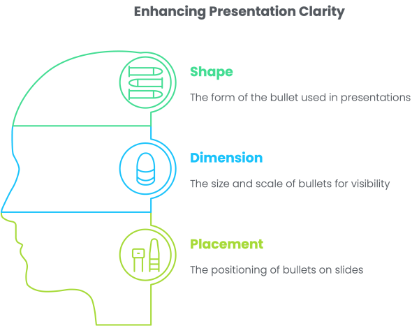
Shape of Bullet: Bullets with the shape of filled circle, filled square, open circle, hyphen and arrow are the most prominent bullet-types. The basic purpose is the ease for the audiences in reading the important words of the presentation. You can opt for a specific bullet-type as per your liking and need, keeping in line with the font you have selected for the texts. Even graphics can be bulleted, but this exercise must be done sparingly and you must bear in mind that these bulleted graphs or graphics don’t take away the concentration of the audiences from the textual matter.
Dimension of Bullet: The convention Bullet Point Formatting has always been to opt for a bullet which bears the size somewhat smaller than the font of the texts so that these Bullet Points do not divert the attention and the interest of the audiences from the texts.
Bullet-placing: Going for effective Bullet Point usage and accordingly choosing their specific type is only done for highlighting the textual material, or sometimes graphics, to make the entire presentation for the audiences increasingly simpler and easier to understand. So, making everything cramped and congested hardly solves the purpose. A perfect placing of a bullet, having enough space between the bullet and the first letter of the text beside it is crucial. Words after bullets must be easily noticeable.
So, while Bullet Points are often-repeated font-effects, they need to be selected deftly and keep the entire presentation in mind.
Effective Bullet Usage
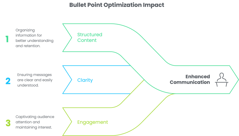
Bullet points are a fundamental tool in presentations, reports, and documents. They help break down complex information into digestible pieces, making content clearer and more engaging. One can argue the importance of bullets are no less than graphs in presentations, yet people pay very little attention to none on this. Also, not all bullet points are created equal. Choosing the right type of bullet can significantly enhance readability and retention. This blog explores different bullet styles, when to use them, and how strategic formatting can improve communication effectiveness.
Why Bullet Points List Optimisation Matter
Studies show that structured content improves comprehension and engagement:
- 91% of professionals find well-designed visual presentations more engaging (Source: Prezi).
- Numbered lists improve comprehension by 40% compared to unordered bullets (Source: HubSpot).
- Teams using visual indicators for tracking are 35% more likely to complete projects on time (Source: PMI Report).
PPT Experts always pay attention by carefully selecting bullet styles, businesses, educators, and content creators can ensure their message is clear and effective.
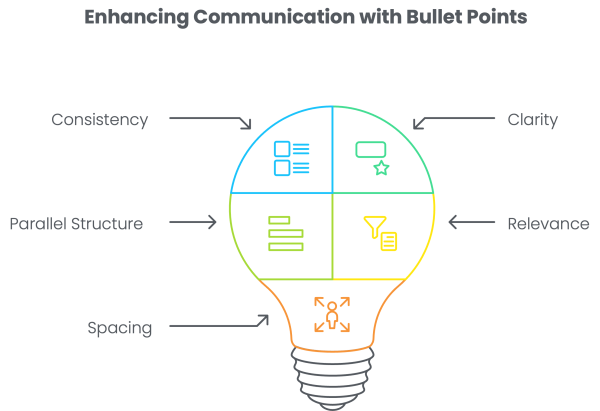
- Consistency: Use the same bullet style and formatting throughout a document.
- Clarity: Keep bullet points concise - each point should convey a single idea.
- Parallel Structure: Ensure all bullets follow the same grammatical format.
- Relevance: Include only information directly related to the topic to maintain engagement.
- Spacing: Maintain adequate space between bullets and text for readability.
Best Practices for Using Bullet Points Effectively
Conclusion
Choosing the right bullet points isn't just a design choice-it's a strategic communication tool in presentations and documents. By selecting appropriate bullet styles, using visuals, and applying best practices, you can make content more engaging, memorable, and effective. Whether in corporate settings, education, marketing, legal, or project management, bullet points play a crucial role in delivering clear, impactful messages.