
If you are a Project Director or HSE Lead working on a mega-project in the Kingdom of Saudi Arabia (KSA)—whether it’s NEOM, Red Sea Global, or a Saudi Aramco site—you know the “Friday Night” ritual all too well.
You have thousands of workers on site. You have terabytes of safety data coming in from toolbox talks, site inspections, and incident logs. But instead of analyzing that risk, your highest-paid safety engineers are spending 6 to 10 hours a week doing administrative grunt work.
They are taking screenshots of Excel tables. They are fighting with PowerPoint formatting. They are trying to make a Construction Safety Report look presentable for a Saturday morning Board meeting.
The result? A “Frankenstein” deck of blurry tables and unreadable data.
This isn’t just an annoyance; it is an operational risk. When data is hard to read, trends are missed. And in the heavy industry sector, a missed trend (like a spike in Near Misses in Zone B) can lead to a catastrophic failure.
At A1 Slides, we believe that Automated Reporting KSA standards demand a shift from “Data Dumps” to “Visual Intelligence.” Here is how we helped a major construction consortium automate their HSE reporting, saving 300+ man-hours annually.
The Challenge: "We Have Data, But No Insights"
Our client, a Tier-1 Contractor handling a major infrastructure package, faced a critical bottleneck. Their weekly HSE report was 60 slides long.
- The Workflow: 5 different Safety Officers sent 5 different Excel sheets to a central coordinator.
- The Format: The coordinator manually copied and pasted rows into PowerPoint.
- The Output: A dense, text-heavy document that the Project Director skimmed in 2 minutes.
- The Pain: “We are reporting the news, not analyzing the risk.”
They needed a HSE Dashboard PowerPoint system that could ingest raw data and output decision-ready visuals instantly.
The Fix: Moving from Excel Tables to Visual Dashboards
We deployed our Insight First Design™ methodology to rebuild their reporting architecture. We didn’t just redesign the slides; we redesigned the data flow.
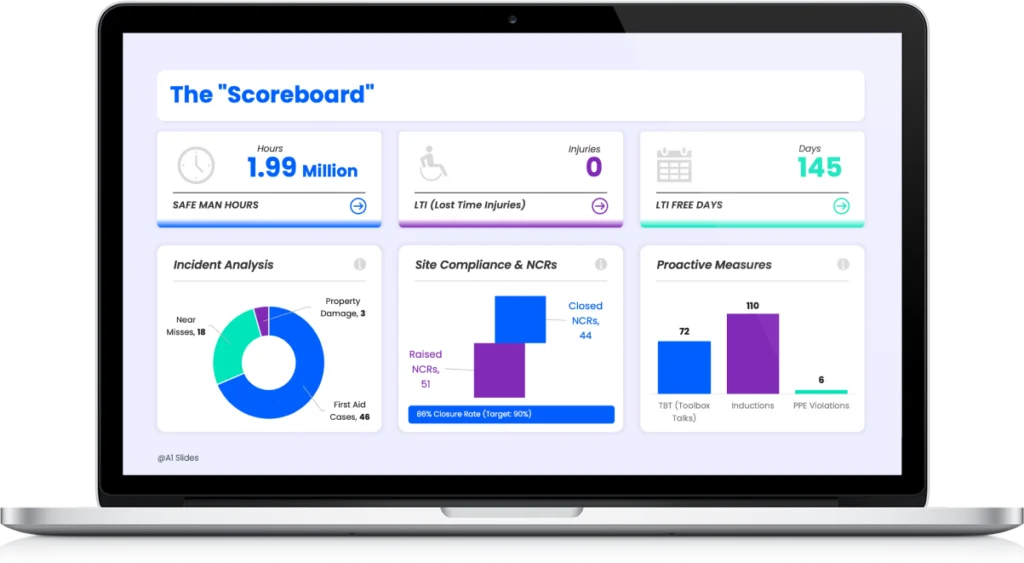
1. The LTI Tracker Slide (The "Scoreboard")
The most critical slide in any safety deck is the LTI (Lost Time Injury) Tracker. In the old deck, this was a spreadsheet showing dates.
- Visual Logic: We utilized a “Green/Red” status indicator for LTI-Free days.
- The “1.99 Million” Visualization: We emphasized the “Safe Man-Hours” number in large, bold typography. This turns a compliance statistic into a point of team pride.
- Benefit: The Board knows the site status within 3 seconds of the slide appearing.
2. Visualizing Leading Indicators (The "Pyramid")
Most reports focus on Lagging Indicators (what happened). We shifted the focus to Leading Indicators (what might happen).
We built a dynamic Heinrich’s Triangle visualization. By mapping “Unsafe Acts” and “Near Misses” visually, the Project Director could see if the bottom of the pyramid was widening—a clear signal that a major incident was inevitable without intervention.
3. Heat Mapping the Risk
Instead of listing “Zone A” and “Zone B” in a table, we overlaid the incident data onto a 3D site map. This created a “Risk Heatmap.”
- The Insight: The Project Director instantly saw that 60% of Near Misses were happening in the “Material Laydown Area.”
- The Action: Resources were immediately reallocated to supervise that specific zone.
The Tech: Secure Data Ingestion
For our KSA clients, data security is non-negotiable. You cannot use open-source plugins or insecure tools.
We implemented a workflow using Microsoft 365 Secure Vaults.
- Ingestion: Site engineers input data into a locked Excel template on SharePoint (Single Source of Truth).
- Linking: The PowerPoint Master Deck is professionally linked to this Secure Vault.
- Automation: When the Excel file is updated on Friday at 5 PM, the PowerPoint dashboard updates automatically.
This ensures Data Integrity. No one can accidentally delete a row or fudge a number. The slide reflects the reality of the site, 100% of the time.
The Result: From 6 Hours to 6 Minutes
By moving to this automated visual system, the client achieved:
- Zero Formatting Time: The slides are always ready. The HSE Manager focuses on the narrative, not the alignment.
- Higher Engagement: The Client (the Asset Owner) praised the clarity of the new reporting format, noting it was the “Gold Standard” for the project.
- Proactive Safety: The team now spends their Friday afternoons analyzing trends rather than cropping screenshots.
Stop Formatting. Start Analyzing.
If you are still managing your Construction Safety Report via manual copy-paste, you are wasting your most valuable resource: your safety experts’ time.
Your weekly report is the primary way the Board judges your site’s control. Make sure it looks as professional as your engineering.
Ready to Upgrade Your Weekly Report?
Don’t start from scratch. We have built the architecture for you.
(Includes the LTI Tracker Slide, Risk Heatmap, and Heinrich Triangle Layouts ready for your data).
A1 Slides specializes in High-Stakes Engineering & Safety Presentations for the Energy, Aviation, and Construction sectors.